.png)


Mobile Website Optimization: Webflow Guide
When we talk about "mobile website optimization," we're not just talking about making your desktop site fit on a smaller screen. It's a whole different ball game. It’s about completely rethinking your site's design, navigation, and performance from the ground up to give visitors on phones and tablets a flawless experience. For those of us building with Webflow, this boils down to two critical things: truly mastering responsive design and achieving blazing-fast load times.
Why Mobile Optimization Is a Must for Webflow Sites
The internet has changed. The days of the desktop being the main window to the web are long gone—smartphones are now in charge. This isn't just a passing trend; it's the new reality, and it has huge consequences for your Webflow site's search ranking, user engagement, and your bottom line.
Think about it: mobile devices now drive roughly 62.54% of all website traffic worldwide. That's a massive jump from just 35% back in 2015. Google has taken notice. They've made it crystal clear that mobile usability is a major ranking signal, which means if your site is a pain to use on a phone, you're essentially invisible on search.
Google’s Mobile-First Indexing Explained
At the core of this whole discussion is Google's mobile-first indexing. Put simply, Google now primarily uses the mobile version of your website to index and rank it. If your Webflow site is a masterpiece on a desktop but slow, broken, or frustrating on a phone, Google judges it based on that subpar mobile experience. Period.
This direct line between mobile performance and SEO makes optimization a non-negotiable part of any web project. To get a better handle on what this means for your site's technical setup, it's worth digging into the technical SEO best practices for mobile-first indexing.
Your website doesn't have two separate versions in Google's eyes anymore. There is only the mobile version. How it performs, looks, and functions on a smartphone is how Google evaluates its quality.
The Pillars of Mobile Success in Webflow
As we go through this guide, we'll zero in on the core principles you need to build a top-tier mobile site in Webflow. Getting these right is directly tied to your site's ability to grow.
- Responsive Design Mastery: We'll move beyond just using Webflow's default breakpoints. You'll learn to create truly fluid layouts with Flexbox, Grid, and relative units that look perfect on any screen.
- Performance and Core Web Vitals: You'll discover how to audit and drastically improve key speed metrics like Largest Contentful Paint (LCP) and Cumulative Layout Shift (CLS) to deliver that instant-loading feel on mobile.
- Mobile-Centric User Experience (UX): It's all about practical, conversion-focused design. We're talking touch-friendly buttons, dead-simple navigation, and forms that don't make mobile users want to throw their phones.
How to Audit Your Webflow Site's Mobile Performance
Before you can fix a single thing, you need a clear, unbiased diagnosis of your Webflow site’s mobile health. Just diving into optimizations without a baseline is like trying to navigate a new city without a map—you’ll get lost, fast. A proper performance audit turns those vague feelings of "it's slow" into a concrete, prioritized action plan.
The best tool for the job is already built right into your browser: Google Lighthouse. You can find it in Chrome DevTools, and it’s the gold standard for measuring how your site actually performs for mobile users. This is the same lens Google uses to evaluate your page experience.
Running Your First Lighthouse Audit
Getting started is straightforward. Just open your Webflow site in a Chrome incognito window (this is important, as it prevents your browser extensions from skewing the results), right-click anywhere on the page, and hit "Inspect." From there, navigate over to the "Lighthouse" tab.
To run a mobile-specific test, make sure your settings look like this:
- Mode: Navigation (this is the default)
- Device: Mobile
- Categories: Check Performance, Accessibility, Best Practices, and SEO.
Click "Analyze page load," and in about a minute, you’ll have a detailed report card. Don't sweat it if the initial score is low; think of this report as your roadmap to a faster site. It points out the exact issues that need your attention.
Decoding Core Web Vitals for Webflow
The Lighthouse report is dense with information, but your immediate focus should be on the Core Web Vitals. These are the three core metrics Google uses to measure real-world user experience. Understanding what they mean in a Webflow context is key to effective mobile website optimization.
- Largest Contentful Paint (LCP): In plain English, this is how long it takes for the biggest visual thing on the screen—usually a hero image or a large headline—to show up. In Webflow, a poor LCP score almost always points to an uncompressed image you uploaded to the Asset Manager or a video background that’s way too heavy for a mobile connection.
- Interaction to Next Paint (INP): This metric, which replaced the older First Input Delay (FID), measures overall responsiveness. It checks how quickly your page reacts when someone clicks, taps, or types. A high INP on a Webflow site is often caused by complex, multi-step interactions or heavy custom JavaScript that bogs down mobile processors.
- Cumulative Layout Shift (CLS): This one tracks visual stability. It flags any elements that move around unexpectedly after the page loads, which is incredibly annoying for users. Common culprits in Webflow include custom fonts loading late and causing text to reflow, or images without specified dimensions that suddenly pop into place and push all the content down. A quick Webflow fix is to select the image element, go to the Style panel, and manually enter its width and height under the "Size" section. This tells the browser exactly how much space to reserve.
This simple diagram shows how Googlebot simulates a user's mobile journey to figure out your ranking.

The takeaway here is that what the crawler experiences on a mobile device has a direct line to your site's final search engine position.
Turning Your Audit into an Action Plan
With your Lighthouse report in hand, it’s time to build a to-do list. The report conveniently lists opportunities for improvement, ordered by how much of an impact they’ll make. For a more exhaustive approach, you can also consult an ultimate website auditing checklist that covers all the bases beyond just performance.
Your prioritized list might start to look something like this:
- Compress Hero Image: Lighthouse flagged
hero-image.pngas being way too big. - Specify Image Dimensions: Add explicit width and height to the logo and social icons to fix CLS.
- Defer Custom Script: A third-party chat widget script is blocking the page from loading.
Remember, the goal isn't just a high score for vanity's sake; it's a genuinely better, faster experience for your mobile visitors. Your audit gives you the precise, data-driven steps to get there.
By methodically working through this audit, you translate raw performance data into a tangible set of tasks right inside your Webflow project. This is the foundation of any successful mobile optimization strategy.
Mastering Responsive Design for a Flawless Mobile UX
An audit gives you a map, but the real journey of mobile optimization happens inside the Webflow Designer. This is where you graduate from just making a site fit on a smaller screen to crafting an experience that feels truly native to a mobile device. Basic responsiveness is just the entry fee; we’re aiming for a fluid, fast, and touch-friendly interface that people genuinely enjoy using.
To pull this off, we have to think beyond Webflow’s default breakpoints. Modern mobile design isn't about hitting a few specific device widths—it’s about creating a truly flexible system that looks great on any screen.
Building Fluid Layouts with Flexbox and Grid
Hardcoding element sizes with pixels is a surefire way to create a brittle, broken mobile experience. To build a layout that gracefully adapts to any screen imaginable, you need to get comfortable with Flexbox and Grid.
- Flexbox is your go-to for one-dimensional layouts. Think of it as the master of alignment along a single line, whether horizontal or vertical. It’s perfect for navigation bars, centering content inside a section, or making sure a row of cards distributes space evenly. Actionable Webflow Tip: To center an item both horizontally and vertically inside a section, select the parent section, set its
DisplaytoFlex, then setDirectiontoVerticaland bothAlignandJustifytoCenter. - Grid is for the heavy lifting of two-dimensional layouts. When you need to control both rows and columns at the same time, Grid is the tool for the job. It's ideal for complex page structures or product galleries. Actionable Webflow Tip: On the mobile breakpoint, instead of complex Grid layouts, simplify it. Select your Grid container, go to the Style panel, and change the column definition to a single column (
1fr) and set rows toautoto stack your grid items vertically.
The real magic happens when you use them together. A classic, battle-tested approach is to use Grid for the main page structure (header, main content area, footer) and then use Flexbox for the components inside those grid areas. This combination gives you the best of both worlds: robust structure and flexible content.
Embracing Scalable Units for True Fluidity
Alongside Flexbox and Grid, the units you choose are just as important. Pixels (px) are familiar, but they create rigid, inflexible designs. To build a site that scales beautifully, you need to lean on relative units.
- REM (Root EM): This should be your default for typography and most spacing (like padding and margins). A
remis based on the browser's root font size. This is a massive win for accessibility, as users who set a larger default font in their browser will see your entire interface scale up proportionally, just as you designed it. - VW/VH (Viewport Width/Height): These units are tied directly to the size of the browser window. For example,
1vwis equal to 1% of the viewport's width. This is incredibly useful for things like hero sections that need to fill the entire screen or for headlines that should scale up and down smoothly with the browser width.
By combining Flexbox and Grid with relative units like REM and VW, you stop designing for a handful of breakpoints. Instead, you start creating for a seamless continuum of screen sizes. Your site will look just as good on a tiny Android phone as it does on a large tablet, with no awkward jumps or broken layouts.
Designing for Touch: A Thumb-Friendly Experience
A slick mobile layout means nothing if it’s a pain to actually use. On mobile, our clumsy thumbs replace the pixel-perfect precision of a mouse cursor, and that demands a completely different approach to designing interactive elements.
The stakes are incredibly high. Mobile bounce rates often hover around a staggering 60%, and research shows 40% of consumers will jump to a competitor after just one bad mobile experience. You can see more data on mobile user behavior to really understand how little patience users have.
This is where you'll spend your time in the Webflow Designer, tweaking styles across different breakpoints to nail the mobile experience.
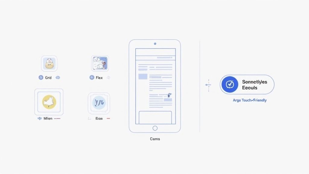
Each of those icons at the top is a different viewport, letting you fine-tune your design to ensure it’s not just visible, but truly usable.
User experience priorities shift dramatically between a large desktop monitor and a small phone screen. What works for a mouse and keyboard often fails with a thumb and a touch interface. Here's how to address those changes in Webflow.
Desktop vs Mobile UX Priorities & Webflow Tactics
To get this right in Webflow, here are a few non-negotiable rules I follow:
- Make Tap Targets Huge: Tiny text links or icons are a user's worst enemy. A good rule of thumb is to aim for a minimum tap target size of 48x48 pixels for any interactive element. The great thing about Webflow is you don't need a huge icon; you can just add padding to the link element to expand its clickable area without messing up your design.
- Kill Hover-Dependent Interactions: This is a big one. Any interaction that relies on a mouse hover to reveal content—like a dropdown menu or a tooltip—is completely broken on touch devices. Webflow Tutorial: To fix this, go to the Interactions panel. If you have an interaction triggered by
Mouse hover, create a new one triggered byMouse click (tap)for the mobile breakpoints. You can use this to control a "Show/Hide" animation for your dropdown content. - Give Everything Room to Breathe: White space is crucial on mobile. Increase the padding around buttons and add more margin between form fields. This not only looks cleaner and improves readability but, more importantly, it drastically reduces the chance of users tapping the wrong thing.
Advanced Performance Tricks for a Faster Webflow Site
A beautiful, responsive layout is table stakes. But on mobile, speed is the final boss. Every millisecond really does count, and while Webflow gives you a fantastic head start with its clean code and automatic asset handling, true mobile optimization demands a more hands-on approach. Pushing your site from "fast enough" to "instant" means getting under the hood and managing your assets before they ever hit the Webflow Designer.
This is all about proactive optimization. Instead of just letting Webflow’s responsive image features do their thing, you take control from the very beginning. By preparing your assets and scripts to be as lean as possible, you give mobile devices far less work to do when they have to render your page.
Pre-Optimizing Your Images for Peak Performance
Images are almost always the heaviest part of a webpage. They're the number one culprit for slow mobile load times, hands down. Webflow's automatic srcset generation is a great feature, but it can only work with the file you give it. If you upload a massive 4MB hero image, Webflow will dutifully create smaller versions, but the process is nowhere near as efficient as it could be.
The professional workflow is to optimize images before they touch the Webflow Asset Manager.
- Manual Compression: Tools like TinyPNG or ImageOptim should be your best friends. Run every single image through one of these first. They use smart algorithms to strip out useless data from the file without any visible drop in quality. It's not uncommon to see file size reductions of 50-70% or more from a single click.
- Choosing the Right Format: Don't just default to JPG or PNG out of habit. The WebP format, developed by Google, delivers significantly smaller file sizes at the same quality level—often 25% smaller than a comparable PNG or JPG. You can use online converters or even export directly to WebP from tools like Sketch and Figma, giving you a huge performance edge right away.
- Actionable Webflow Step: In the Asset Manager, click the gear icon on any uploaded image and toggle on "Lazy load." This tells the browser not to load the image until it's about to enter the viewport, which is crucial for speeding up the initial load time of long pages.
Making this pre-upload discipline a habit is a total game-changer. It guarantees that every single version of an image that Webflow generates is based on an already lean, highly-optimized source file.
Fine-Tuning Your Fonts
Custom fonts add a ton of personality, but they come at a performance cost. Each font file, especially when you have multiple weights (Light, Regular, Bold, Black, etc.), is another request the browser has to make. This all adds up, bogging down your page load time.
For a snappy mobile experience, you need to be ruthless with your font choices.
Webflow Tutorial: Go to your Project Settings > Fonts. Review the list of fonts and weights you have uploaded or integrated. If your mobile design only uses Regular (400) and Bold (700) weights, delete the unused Light, Medium, or Black weights from the project. This simple audit can easily shave hundreds of kilobytes off your initial page load.
For absolute maximum performance, seriously consider using system fonts. Fonts like Arial, Helvetica, and San Francisco are already on the user's device, meaning they require zero download time. While they might lack the unique flair of a custom font, they guarantee the fastest possible text rendering—a smart trade-off for critical landing pages where speed is everything.
Taming Custom JavaScript for a Smoother Load
Custom JavaScript from third-party tools—think analytics, heatmaps, or live chat widgets—can be an absolute performance killer. By default, these scripts often load synchronously. This means the browser has to halt everything, download the script, and run it before it can get back to rendering the rest of your page. This is called "render-blocking," and it's a primary reason for high LCP and INP scores.
Actionable Webflow Tip: Go to Project Settings > Custom Code. In the "Footer Code" section, find your <script> tags. Modify them to include the defer attribute.
- Before:
<script src="path/to/script.js"></script> - After:
<script **defer** src="path/to/script.js"></script>
This simple change tells the browser to download the script in the background and only run it after the rest of the page is loaded. This is the safest and most effective option for nearly all third-party scripts.
Leveraging Webflow’s Built-In Speed Boosts
Finally, don't forget about the powerful optimization tools Webflow gives you right out of the box. You should always have these enabled for your published site.
- Minification: Head to your Project Settings > Hosting > Advanced Publishing Options. Make sure "Minify HTML," "Minify CSS," and "Minify JS" are all toggled on. This automatically strips out unnecessary characters like spaces and comments from your code, making the files smaller and quicker to download.
- Global CDN: Webflow hosts all published sites on a global Content Delivery Network (CDN) powered by Fastly and Amazon CloudFront. This means your site's assets are distributed on servers all over the world. When someone visits your site, the content is delivered from the server closest to them, which drastically cuts down on latency and speeds up load times.
By combining your own manual pre-optimization with Webflow's powerful built-in features, you create a multi-layered strategy that delivers elite mobile performance.
Designing for Conversions on Mobile Devices
A fast, responsive site is just the starting point. The real goal of mobile website optimization is to turn those visitors into customers, subscribers, or leads. This is where we shift focus from pure speed to user experience (UX) strategies that make it dead simple for someone on a phone to do what you want them to do.
It all boils down to reducing friction. On a small screen, every extra tap, every confusing step, and every form field that’s a pain to fill out is an invitation to leave. Our job is to design an interface that guides users to the finish line without them even noticing the effort.

Simplify Your Mobile Navigation
On a desktop, you have all the real estate in the world for sprawling mega-menus. Try that on a phone, and you get a cluttered, unusable mess. The first order of business is to streamline your navigation into something clean and intuitive.
For most Webflow sites, this means leaning into familiar, user-friendly patterns:
- The Hamburger Menu: It's the classic three-lined icon for a reason—everyone knows what it does. It tucks away your full navigation, keeping the interface clean until it's needed. Webflow's built-in Nav Menu component makes it easy to style the mobile "hamburger" state just right.
- Bottom Tab Bar: If you're building a web app or a site with a few core actions (like Home, Search, Profile), a bottom tab bar is brilliant. It offers persistent, one-tap access to the most important destinations. Webflow Tutorial: Create this by dragging a
Div Blockonto the page. Give it a class likemobile-tab-bar. In the Style panel, set itsPositiontoFixed, anchor it to the bottom, and give it a highz-index(like 1000). Use Flexbox to align your icon links inside it.
The trick is to prioritize mercilessly. Your mobile menu shouldn't be a carbon copy of your desktop one. Only feature the absolute must-have links. Everything else can be grouped under a single "More" or "Services" link to keep things tidy.
Optimize Forms for Thumbs and Taps
I’ve seen more conversions die at the mobile form stage than anywhere else. If someone has to pinch, zoom, and fight to fill out your contact or checkout form, they're gone. Fortunately, optimizing forms in Webflow for mobile is pretty straightforward if you pay attention to the details.
Mobile commerce has exploded into a trillion-dollar industry, yet retailers collectively lose an estimated $2.6 billion each year just from slow websites. This really drives home how critical a frictionless mobile experience is for your bottom line. You can read more on the impact of mobile marketing.
A few small tweaks in the Webflow Designer can make a massive difference:
- Go Single-Column: Never, ever use multi-column layouts for forms on mobile. A single, linear flow is infinitely easier for someone to follow on a small screen.
- Use HTML5 Input Types: This is a simple but powerful one. When you add a form field in Webflow, head over to the Element Settings panel (the gear icon) and choose the correct "Type." Selecting
Emailbrings up the keyboard with the "@" symbol ready to go. ChoosingTelbrings up the numeric keypad. This little detail saves users from the annoyance of switching keyboards manually—a classic friction point. - Large, Clear Labels: Always place labels directly above their corresponding input fields. This creates a clear visual connection and ensures they don't get awkwardly cut off on narrow screens.
Make Your Call-to-Action Impossible to Miss
As a user scrolls down a long mobile page, your main call-to-action (CTA) can easily get lost in the content. They might be ready to sign up or make a purchase, but if the button isn't visible, that moment of intent evaporates. The fix? A sticky CTA.
This is simply a button or a bar that stays fixed at the bottom of the screen as the user scrolls, keeping your most important action always within easy reach of their thumb.
Here’s a quick recipe for building one in Webflow:
- Drag a
divblock onto your page and place your button inside it. Give the div a class likesticky-cta-wrapper. - Style the
divwith padding and a background color to look like a bar. - In the Style Panel, under Position, select
Fixed. Choose the bottom-full option to anchor it. - Give it a high
z-index(something like 9999) to make sure it always floats on top of everything else. - Crucial Step: Go to the mobile breakpoint and set its display to
BlockorFlex. On the desktop breakpoint, set its display back toNoneso it only appears on smaller screens.
This one technique keeps your conversion goal front and center, dramatically increasing the odds that a visitor will take that final, crucial step.
FAQs: Your Webflow Mobile Optimization Questions Answered
When you get deep into optimizing a Webflow site for mobile, a few common questions always seem to pop up. Let's tackle them head-on with some practical answers based on real-world experience.
How Much Does Webflow Already Do for Mobile Performance?
You actually get a huge leg up right from the start. Webflow is designed to output clean, semantic code, and it automatically handles minifying your HTML, CSS, and JS when you hit publish. That means your code is already pretty trim without you having to do anything extra.
On top of that, Webflow’s global CDN (powered by giants like Fastly and AWS) gets your assets to users quickly, no matter where they are. The real game-changer, though, is its automatic creation of responsive image variants with srcset. This ensures smaller devices get appropriately smaller images. Think of this as your baseline—our job is to build on that solid foundation.
My Webflow Site Looks Responsive, but It’s Still Slow on My Phone. What Gives?
This is the most common problem I see. If the layout is solid but the site feels laggy on a mobile connection, the issue is almost always your assets. In 9 out of 10 cases, someone has uploaded massive, uncompressed images or videos directly into the Asset Manager. Webflow’s srcset is amazing, but it can only do so much if the source file is a 5MB monster.
The next likely suspect is heavy custom code or intricate page-load animations that are just too much for a mobile CPU to handle. The quickest way to find the bottleneck is to run a Lighthouse audit. It will literally point you to the exact images or scripts that are clogging things up, so you can stop guessing and start fixing.
It's a classic mistake to think a responsive layout automatically means a fast mobile site. They are two different things. Performance is all about the weight of your assets and the efficiency of your code.
Should I Just Hide a Bunch of Stuff on Mobile to Speed It Up?
Tempting, but be very careful with this. Hiding content on mobile with display: none can be a major red flag for Google. Since Google operates on mobile-first indexing, their rule is simple: if the content isn't visible on the mobile version, it might as well not exist for ranking purposes. You could accidentally tank your SEO.
Instead of hiding content, your goal should be to reformat it for a better mobile UX. Here’s how you can do that right inside Webflow:
- Use Accordions: The native
Dropdownelement in Webflow is perfect for turning long FAQs or chunky feature lists into clean, tappable sections. Drag it onto the page and style theDropdown ToggleandDropdown Listto match your brand. - Implement Tabs: For grouping related content, the
Tabscomponent is your best friend. It lets users explore without having to scroll endlessly. Simply drag it from the Add panel and populate each tab pane with your content.
The objective is always content parity. Mobile users should have access to the same valuable information as desktop users; it just needs to be presented differently. Only use display: none for purely decorative elements that have zero impact on SEO or user understanding.
Ready to transform your Webflow site from just a website into a consistent revenue engine? Block Studio LLC offers a unified growth package, combining expert Webflow development with data-driven SEO, content production, and conversion optimization to deliver compounding results. Turn your website into your number one growth channel.
Article created using Outrank