.png)


How to Improve Website Conversion Rate A Webflow Guide
Trying to improve your website’s conversion rate without data is just guesswork. You might get lucky, but you'll probably waste a ton of time and energy on changes that don’t move the needle. The whole process really boils down to systematically tracking what users do, figuring out where they get stuck, and then running smart experiments to smooth out those friction points.
For those of us building on Webflow, this means getting cozy with tools like Google Analytics 4, Hotjar, and Google Tag Manager. These are your keys to unlocking actionable data.
Setting Your Foundation in Webflow with Smart Analytics
Before you can even think about improving conversions, you have to know what’s happening on your site right now. Skipping this step is like trying to navigate a new city without a map—you're basically flying blind. Building a solid analytics foundation in your Webflow project is the only way to turn random ideas into a clear, data-driven strategy.
This isn't about chasing vanity metrics. We're talking about gathering real intelligence that informs every decision you make, whether it's tweaking a button color or overhauling an entire page. The goal here is to paint a clear picture of user behavior, define what a "win" actually looks like, and set a baseline to measure all your future efforts against.
Define and Track Your Conversion Goals
First things first: what’s the single most important action you want a visitor to take? For a B2B SaaS company, that’s probably a "Demo Request" or a "Free Trial Signup." If you're a service-based business, it’s likely a "Contact Form Submission." Everything else on your site should be designed to gently guide users toward this one primary goal, your macro-conversion.
Once you've identified it, you need to track it. Luckily, Webflow makes this pretty straightforward.
- Google Analytics 4 (GA4): Start by adding your GA4 measurement ID to your Webflow project. You’ll find this in
Project Settings > Integrations > Google Analytics. This gets the basic pageview data flowing. - Custom Events: To track a form submission, you can set up a "Thank You" page. In your Webflow form settings, under "Success/Error States," set the "Redirect URL" to this new page. A visit to that page is a dead giveaway of a successful conversion, which you can then set up as a goal in GA4.
- Google Tag Manager (GTM): For more granular tracking—like clicks on a specific CTA button without a page redirect—GTM is essential. In
Project Settings > Custom Code, add the GTM container code to the "Head Code" and "Footer Code" sections. This lets you deploy tracking tags for specific element IDs or classes without touching the site's design.
A classic mistake is trying to track too many "goals" at once. Seriously, just start with one primary macro-conversion. You can always track smaller micro-conversions (like a newsletter signup or a PDF download) to gauge engagement, but keep your main focus on the action that actually drives revenue.
Calculate Your Baseline Conversion Rate
With your tracking in place, it’s time to figure out where you stand today. Calculating your baseline conversion rate is simple math:
(Total Number of Conversions / Total Number of Unique Visitors) x 100 = Conversion Rate
So, if you got 50 demo requests from 2,500 unique visitors last month, your conversion rate is 2%. This number is now your benchmark. Every single test and tweak you make from here on out will be measured against this baseline to see if it had a positive, negative, or neutral impact. For a deeper dive, checking out proven strategies to improve website conversion rates can provide some excellent next steps.
See What Your Users See with Session Recordings
The quantitative data from GA4 tells you what is happening, but it leaves out the most important part: why. This is where session recording and heatmap tools are absolute gold. Integrating a tool like Hotjar or Microsoft Clarity into your Webflow site is as simple as dropping a small snippet of code into your project's custom code area (Project Settings > Custom Code > Head Code).
These tools let you watch anonymized recordings of real people using your website. You can see exactly where their mouse goes, what they click on, and where they get frustrated and leave. This kind of qualitative insight is priceless for spotting conversion blockers you’d never find by just staring at spreadsheets and graphs.
Finding What’s Broken: Pinpointing Conversion Killers with Funnel and UX Audits
Okay, you’ve got your analytics humming along nicely. That's the first step. You can see what’s happening on your site. Now for the fun part: figuring out why.
This is where you roll up your sleeves and become a bit of a digital detective. We’re moving beyond the dashboards and into the nitty-gritty of your user’s experience. The goal is to hunt down the friction points, confusing journeys, and dead ends that are costing you leads and sales.
It’s all about empathy. You need to put yourself in your visitor’s shoes and feel their pain. By blending a hands-on user experience (UX) audit with a more technical funnel analysis, you'll build a hit list of the exact issues that are stopping people from becoming customers.
Getting Practical: How to Run a UX Audit on Your Webflow Site
A UX audit is basically a systematic health check of your website's interface. You're looking for anything that makes it hard for people to use. For those of us building in Webflow, this means scrutinizing the design, layout, and interactive elements to ensure they're guiding users, not getting in their way.
The best way to start? Try to use your own site as if you’ve never seen it before. Even better, grab a coworker from another department, sit them down, and watch them try to complete a key task without any help from you. It can be a humbling experience.
Keep an eye out for these common offenders:
- Navigation & Clarity: In Webflow, check that your
Nav Linkelements have clear, jargon-free labels. Is the "Pricing" page easy to find? Does your primary CTA in the navbar stand out? - The Mobile Reality: Use Webflow's device previews (especially mobile portrait) to check for usability issues. Are your tap targets big enough? Do forms require excessive zooming? A clunky phone experience is a conversion killer.
- Messaging & Visual Hierarchy: Does your
H1tag connect with why someone landed there? Is your most important information impossible to miss? If your call-to-action button is buried, don't be surprised when no one clicks it.
A UX audit isn't about nitpicking every tiny flaw. It's about finding the big, glaring roadblocks that make high-intent visitors give up and leave. A confusing pricing table is a five-alarm fire; a typo in the footer can wait.
Seeing Through Your Users' Eyes with Session Recordings
This is where your secret weapons come in: session recording tools like Hotjar or Microsoft Clarity. They let you watch anonymous recordings of real user sessions.
Don't just watch random clips. Filter for sessions where users landed on a critical page—like your pricing or contact page—but then left without converting. You’re looking for tell-tale signs of frustration.
Are people furiously clicking on a title or an image that isn't actually a link? We call those "rage clicks," and they're a dead giveaway of a confusing design. In Webflow, this might mean an element looks like a button but isn't wrapped in a Link Block. Do you see them scrolling up and down the same page, looking lost? That usually points to unclear messaging. These recordings are gold for understanding why people bail. For more ideas on this, check out our guide on how to reduce website bounce rate.
Building a Funnel in GA4 to Find the Leaks
While recordings show you individual user struggles, a funnel analysis shows you where you're losing visitors at scale. In GA4, you can use the "Funnel exploration" report to map out the exact steps a user should take to convert.
For a typical B2B Webflow site, that path might look something like this:
- Homepage Visit: The starting point.
- Pricing Page Visit: They're showing clear interest.
- Demo Request Page Visit: They're moving toward a decision.
- Demo Form Submission (Thank You Page Visit): The conversion!
The report will visualize this journey and show you the percentage of people who drop off at each stage. If you see that 90% of visitors who land on your pricing page never make it to the demo request page, you’ve just found a massive leak in your funnel. That page immediately becomes your number one priority. Is the pricing confusing? Is the value proposition weak? Is the CTA invisible?
By the time you finish this process, you'll have transformed a vague goal like "improve conversions" into a concrete, data-backed list of problems to solve. You’ll have a clear picture of which pages are failing, visual proof of user frustration, and the exact points in the journey where you’re losing money. This is the raw material you need to build a powerful and effective CRO roadmap.
Building Your CRO Roadmap for Continuous Improvement
So, you've dug through the data and pinpointed the conversion blockers on your Webflow site. Great. But what now? A scattered, "fix-it-as-you-see-it" approach is a recipe for wasted effort. To really move the needle on your conversion rates, you need a repeatable system—a roadmap for turning those audit findings into strategic experiments.
This is where we shift from just knowing the problems to actively solving them. It’s about forming clear, testable ideas, ranking them by potential impact, and then setting up clean experiments to prove (or disprove) our assumptions. This is how you build a real growth engine, not just run a one-off campaign.
Formulating a Strong, Testable Hypothesis
Every problem you've uncovered needs to be framed as a hypothesis. A weak hypothesis is just a vague idea, like, "Making the CTA button bigger should help." A strong hypothesis, on the other hand, is specific, measurable, and has a clear rationale behind it.
I've always found this simple structure to be incredibly powerful: "If we [implement this change], then [this specific outcome] will happen, because [this reason]."
Let’s walk through a real-world example from a B2B site:
- Problem We Found: Session recordings showed visitors stalling on the pricing page. They'd scroll, hover over the "Learn More" CTA, but then just leave.
- Our Hypothesis: *If we change the primary CTA button on the pricing page from "Learn More" to "Get a Free Demo," then demo request form submissions will increase by 15%, because the new copy instantly clarifies the next step and directly communicates value.*
This format forces you to define the action, predict a measurable result, and justify your thinking. That justification often comes from a deep understanding of your ideal customer. In fact, well-researched buyer personas make these hypotheses much sharper. If you haven't built yours out yet, check out our guide on how to create buyer personas.
The flow chart below shows how this all starts—finding the friction points that become the raw material for your hypotheses.
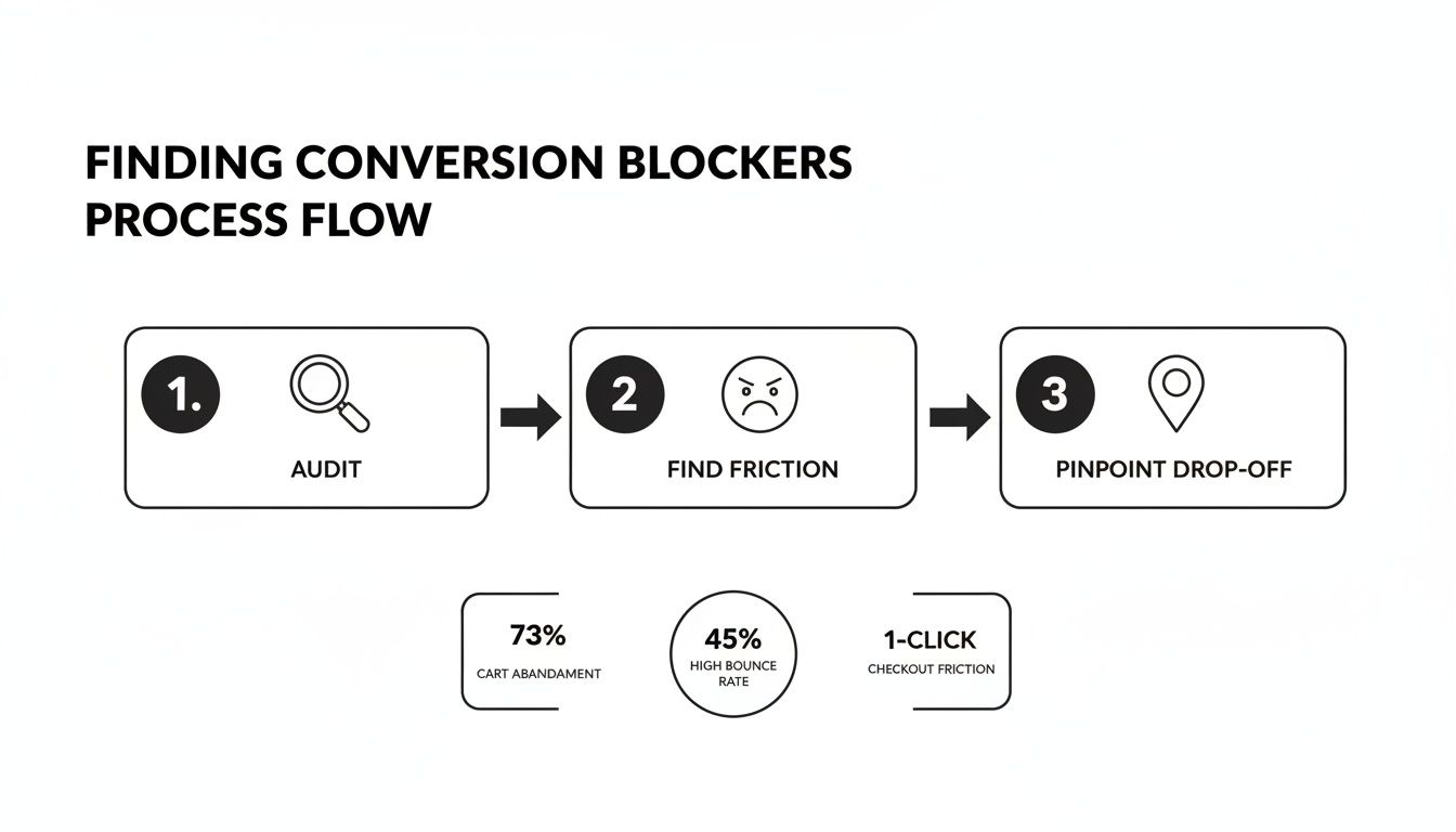
As you can see, a systematic audit uncovers user friction and drop-off points, which are the perfect foundation for your next round of tests.
Prioritizing Your Experiments with the PIE Framework
Chances are, you'll end up with dozens of great ideas. You can't test them all at once. You need a way to prioritize, and the PIE framework is a fantastically simple and effective tool for the job.
It works by scoring each hypothesis from 1-10 across three criteria:
- Potential: How much of an improvement can this change actually generate? Tweaking a headline on your highest-traffic landing page has way more potential than changing a button in your site's footer.
- Importance: How valuable is the traffic on this page? An experiment on your checkout or demo request page is far more important than one on your "About Us" page.
- Ease: How quickly can you get this live in Webflow? A simple copy change is a 10 (super easy), while a complete page redesign is probably a 2 (very difficult).
Add up the scores for Potential, Importance, and Ease to get a total PIE score for each idea. The hypotheses with the highest scores shoot to the top of your roadmap. This simple math ensures you’re always focusing on tests that give you the best bang for your buck.
Setting Up A/B Tests for Your Webflow Site
With a prioritized list in hand, you’re ready to start testing. A/B testing (or split testing) is all about showing two different versions of a page to separate segments of your audience at the same time to see which one converts better. It’s the gold standard for data-driven decisions.
Fortunately, several tools play nicely with Webflow for A/B testing:
- VWO (Visual Website Optimizer): A powerful but user-friendly platform with a great visual editor and solid analytics. You can add its tracking code to Webflow's custom code section.
- Google Optimize: Even though it’s being sunset, its core principles are still foundational for understanding how CRO testing works.
- Finsweet Attributes: This is a fantastic, free solution for Webflow users. By adding a simple script and custom attributes to elements in the Designer, you can run powerful A/B tests almost natively, avoiding the performance hit of heavy third-party tools.
The impact of this systematic approach is well-documented. Recent studies show that purpose-built landing pages paired with structured testing can significantly boost conversions. Some reports put median conversion rates for click-focused landing pages around 11–12%, and it's common for structured A/B tests to produce a median uplift of 10–15% for each successful experiment.
Getting Your Hands Dirty: Tactical Fixes in Your Webflow Project
Alright, you've done the strategic work—you've mapped the user journey and have a solid list of hypotheses. Now for the fun part: diving into your Webflow project and making the changes that move the needle. This is where insights become action, and it’s often where you’ll find your quickest wins.
We’re going to focus on five battle-tested areas where small, smart tweaks can deliver an outsized impact on your conversion rates. We’ll talk about dialing in your copy, designing CTAs that actually get clicked, streamlining your forms, building trust, and, of course, making your site faster.
Let’s get tactical.
Nail Your Copy and Calls-to-Action
Your website's copy does the heavy lifting. It needs to speak directly to your visitor and guide them, step-by-step, toward taking action. The most common mistake I see is vague, feature-heavy headlines that completely miss the visitor's core motivation: "What's in it for me?"
Instead of a headline like "Our Advanced CRM Platform," try testing something that hits on a real pain point, like "Stop Juggling Spreadsheets. Start Closing More Deals." See the difference? You've shifted the focus from what it is to what it does for them.
Your Calls-to-Action (CTAs) are the final push. Generic buttons like "Submit" or "Learn More" are absolute conversion killers. They're lazy and uninspiring. A great CTA clearly communicates the value exchange—what they get when they click.
A few simple ways to improve CTAs in Webflow:
- Be specific. Swap "Get Our Newsletter" for "Get Weekly Growth Hacks."
- Create contrast. In the Webflow Designer's Style Panel, make your primary CTA button a color that pops. It shouldn't clash with your brand, but it should be impossible to ignore.
- Use hover states. Add a subtle hover effect in Webflow's
Statesdropdown (e.g., a slight color change or grow effect) to give users instant feedback. It makes the experience feel more responsive and alive.
Build Frictionless Forms People Actually Complete
Nothing kills a conversion faster than a long, complicated form. Every single field you add is another reason for a potential lead to bail. Your job is to make it as easy as possible for them to say "yes."
Ask for the absolute bare minimum you need to start a conversation.
Key Takeaway: Your goal is to initiate contact, not to gather their life story on the first date. You can always ask for more information later. Make that first conversion effortless.
With Webflow, you have total control. Use it.
- Does your "Contact Us" form really need to ask for company size right now? In the Navigator, just select and delete any non-essential
Form Fieldelements. - Can you use placeholder text (e.g., "name@company.com") in the
Form Field Settingsto guide users instead of clunky field labels? - Are you using Webflow’s built-in
SuccessandErrormessage states to give helpful, clear feedback? Customize these to be on-brand and friendly.
Build Credibility with Strategic Trust Signals
Before anyone gives you their email address or credit card number, they need to trust you. Trust signals are the visual proof that you’re legitimate and that other people have had a good experience with your brand.
Placing these signals near your main CTAs is a pro move—it helps quiet that voice of doubt right when it matters most.
Here are a few types to implement in Webflow:
- Client Logos: Use a
GridorFlexboxelement to create a clean logo bar. Set the images to grayscale and have them switch to full color on hover for a polished, professional effect. - Real Testimonials: Use the Webflow CMS to manage testimonials. Create a "Testimonials" Collection with fields for the quote, name, title, company, and headshot. Then, you can dynamically pull them into any page on your site.
- Case Studies: Link to detailed stories that show tangible proof of your results. A simple link like, "See how we helped [Client] boost leads by 40%" is incredibly persuasive.
- Security Badges: If you're using Webflow E-commerce or handling payments, make sure your SSL certificate and any security badges are clearly visible near your checkout forms.
Supercharge Your Site Speed
Page speed isn't just a technical detail anymore; it's a massive conversion lever. Slow sites bleed money. It's that simple. Research has shown that cutting your load time from five seconds to just one can dramatically increase conversions.
In a famous example, Walmart saw a ~2% jump in conversions for every one-second improvement in load time. Those numbers add up fast.
Thankfully, Webflow gives you a lot of control here.
Here's a quick checklist for Webflow speed optimization:
- Compress Images: Always run your images through a tool like TinyPNG before you upload them. Then, in the Asset Panel, ensure Webflow is generating responsive variants and set the format to
WebPwhere possible. - Lazy Load: For any image or video "below the fold," go to the Element Settings panel and set the
Loadattribute toLazy. It’s a one-click performance boost. - Audit Interactions: In the Interactions panel, check for complex "Page load" animations. These can be resource hogs, especially on mobile. Consider simplifying them or setting them to trigger only on desktop breakpoints.
- Minimize Custom Code: Be ruthless with third-party scripts in your
Project Settings > Custom Code. Every script you add is another external request that slows things down. If it isn't essential for conversion, get rid of it.
For a much deeper dive into this topic, check out our complete guide on website performance optimization tips.
To make this even more practical, here's a table of quick wins you can implement directly in your Webflow project, categorized by how much effort they take and the potential impact you can expect.
High-Impact Webflow CRO Quick Wins
Tackling even a few items from this list can lead to noticeable improvements. The key is to start with the low-effort, high-impact fixes to build momentum.
How to Use Social Proof to Build Unshakable Trust
Technical fixes are a huge part of CRO, but let's be honest: conversions are often won or lost on a single, powerful emotion. Trust. Before anyone fills out your form or clicks "buy," they have to believe you can solve their problem. This is where social proof comes in, transforming your Webflow site from a simple brochure into a genuine, trust-building engine.
It’s all about showing that real people and recognizable businesses have already chosen you and are happy they did. When you strategically weave these proof points throughout your site, you’re proactively answering your visitor's biggest unspoken question: "Can I really trust this company?" When the answer is a clear "yes," your conversion rate will follow.

Weaving Proof into Your Webflow Site
Just having testimonials tucked away on a dedicated page isn't going to cut it. You have to think about placement. Different kinds of social proof land differently depending on where the user is in their journey. Your job is to anticipate their skepticism and serve up the right reassurance at the perfect moment.
Here’s how I think about deploying social proof in Webflow:
- Homepage Hero: The second someone lands on your site, hit them with a "Trusted By" logo bar featuring your most impressive clients. This is dead simple to build in Webflow using a Flexbox or Grid element and immediately establishes credibility.
- Service & Feature Pages: Don't just list features. Place specific, relevant testimonials right next to the features they praise. I love using the Webflow CMS for this—you can create a "Testimonials" collection and dynamically pull in quotes that directly relate to the page's topic.
- Pricing Page: This is a high-stakes moment for any visitor. You can cut through the anxiety by placing a powerful testimonial or a quick case study summary right beside your pricing tiers. It reinforces the value right before they have to make a decision.
The Power of Authentic User-Generated Content
Polished, perfectly-worded testimonials are great, but today’s buyers are smart. They can spot marketing-speak from a mile away and are increasingly drawn to more authentic, unscripted proof. This is where user-generated content (UGC) becomes a game-changer.
UGC can be anything from social media shout-outs to detailed video reviews. Visual platforms are especially potent here; a high number of Instagram likes on a customer's post, for example, can be more influential than a paragraph of your own copy. Integrating a live feed of positive social posts or customer photos using your product makes your claims feel real and relatable.
And the data backs this up. Recent analyses show a huge lift from UGC. One 2025 roundup I saw found that sites with UGC had a baseline conversion rate of ~3.2%. But when visitors actually engaged with that content, the conversion rate jumped by an additional ~3.8 percentage points. When that engagement was deep, it sometimes doubled the likelihood of a purchase—a massive ~102% increase.
My Takeaway: Don’t just collect testimonials. Actively encourage and showcase UGC. Run a hashtag campaign, feature customer stories on your blog, or embed a live social feed using a Webflow-compatible third-party tool. This raw, unfiltered proof builds a level of trust that polished marketing materials just can't touch.
Personalizing the Experience for Maximum Impact
Ready for the next level? Personalization. Imagine a visitor lands on your site from a LinkedIn ad targeting the financial services industry. Instead of seeing a generic headline, they see, "The Trusted Solution for Financial Teams," immediately followed by logos of the banks you work with.
This isn't science fiction anymore. By passing URL parameters from your ads to your landing page, you can use a bit of custom script or a no-code tool like Finsweet Attributes to dynamically change headlines, testimonials, and even case studies to match that visitor's industry or pain point.
This personalized approach is brilliant because it does two things at once: it makes the visitor feel instantly understood, and it hits them with the most relevant social proof for their specific context. You’re turning a one-size-fits-all webpage into a tailored, one-on-one conversation, which is a surefire way to boost conversions.
Learning From Your Tests to Decide What's Next
An experiment is only as good as what you learn from it. Once your A/B test is done, you're sitting on a pile of data that will either validate your hypothesis or send you back to the drawing board. This is where you close the loop—digging into the results, sharing what you've found, and using those insights to build a smarter CRO program.
This isn't just about one-off wins. It's about turning CRO into a reliable growth engine for the business. It’s how you prove your work is valuable and build momentum for the next round of improvements.
How to Actually Read A/B Test Results
The single biggest mistake I see teams make is calling a test too early. It's tempting, right? You see one variation pulling ahead after a few days and you want to declare a winner. Don't do it.
To make a call you can trust, you need to hit statistical significance. This number, usually shown as a percentage, tells you how likely it is that your results are real and not just random luck. Most of us in the CRO world won't even look at results until we hit a 95% confidence level. Your testing tool, whether it's VWO or a similar platform, handles the math for you. Just be patient and let it run. If you declare a winner without the stats to back it up, you might be rolling out a change that does nothing—or even hurts conversions.
Build a Simple CRO Dashboard That Tells a Story
To keep track of your progress and show the impact of your work over time, you need one place to see everything. Building a CRO dashboard doesn't have to be a massive project. A Looker Studio report hooked up to your Google Analytics 4 data is a great, no-fuss way to get started.
Here are the core metrics you'll want to track:
- Overall Conversion Rate: This is your north star. It’s the high-level health check for your funnel.
- Conversions by Channel: Which traffic sources are actually driving valuable actions? Is it organic, paid, or direct?
- Funnel Drop-off Rates: A visual breakdown of exactly where people are bailing on their journey.
- Cumulative Uplift: A running total of the projected increase in conversions from all your winning tests. This is your ROI metric.
A great dashboard does more than just show numbers; it tells a story. When you can walk into a meeting and say, "Our tests last quarter drove a 15% lift in demo requests, which we can tie directly to $X in new pipeline," you stop being a cost center. You become a revenue driver.
Create a Learning Loop You Can Build On
Every single test, win or lose, teaches you something important. A winning test confirms an assumption you had about your customers. But a losing test? That’s often where the real gold is. It tells you your mental model of the user was wrong, forcing you to ask smarter questions.
This is the heart of an iterative growth process:
- Analyze the "Why": Why did the new version win? Was it the headline copy? The simpler design? The offer itself? Get specific.
- Document Everything: Keep a simple log of every experiment—your hypothesis, the results, and what you learned. This becomes your team’s playbook.
- Iterate Intelligently: Let the last test inform the next one. If changing the CTA button text from "Get Started" to "See Pricing" worked, what could you test on the headline next to build on that learning?
This cycle of testing, learning, and building is how you get compounding returns from CRO. You're not just bumping up a conversion rate; you're developing a deep, nuanced understanding of your customer. And that’s the ultimate advantage.
At Block Studio, we don't guess—we build data-driven growth engines for ambitious Webflow teams. If you’re ready to turn your website into your most effective sales channel, learn more about our unified CRO, SEO, and content services at https://www.blockstudio.co.