.png)


10 Essential Website Navigation Best Practices for Webflow in 2025
An intuitive, well-structured navigation is the backbone of any successful website, guiding users to what they need and turning visitors into customers. Poor navigation leads to frustration, high bounce rates, and lost revenue. For Webflow site owners, mastering navigation isn't just a design choice, it's a critical component of growth, directly impacting user experience and conversion rates. Getting this right means users can find information effortlessly, which is a key factor in building trust and achieving business goals.
This comprehensive guide breaks down 10 essential website navigation best practices, packed with actionable tutorials specifically for Webflow. We'll move beyond generic advice to provide step-by-step instructions, real-world examples, and the 'why' behind each principle, empowering you to build a user experience that drives results. For a truly seamless user journey, it's crucial to understand how users interact with your site, making proactive adjustments based on usability testing for improved user experience. This data-driven approach ensures your design decisions are grounded in real user behavior.
Whether you're a B2B SaaS company aiming for SEO-driven growth or a professional services firm seeking more qualified leads, these proven strategies will help you create a navigation system that is clear, accessible, and optimized for conversion. You will learn how to implement everything from sticky headers and mega menus to mobile-first patterns and accessible design, all within the Webflow platform. Let's dive into the core principles that will transform your site's navigation from a simple menu into a powerful conversion tool.
1. Keep Navigation Simple and Intuitive
The most fundamental of all website navigation best practices is to prioritize simplicity. Your site’s navigation should act as an invisible guide, effortlessly directing users to their destination without causing confusion or friction. This principle, championed by UX pioneers like Don Norman, centers on reducing the cognitive load on visitors. When users don't have to think hard about how to find something, they are more likely to stay engaged, explore deeper, and ultimately convert.

A simple navigation structure uses clear, predictable labels and a logical hierarchy that mirrors user expectations. Sites like Apple.com exemplify this with a clean, product-focused top menu, while Medium.com uses straightforward categories that make content discovery feel natural. The goal is to make the path of least resistance the one that leads to the information your user is seeking.
Why It Matters
A cluttered or confusing navigation is a primary cause of high bounce rates. If users can't find what they need within seconds, they will leave for a competitor's site. Simple navigation directly impacts user satisfaction, builds trust, and improves key business metrics by making it easier for visitors to complete tasks, such as making a purchase or filling out a contact form.
"If the user can’t find it, it doesn’t exist." - Jakob Nielsen, Nielsen Norman Group
Actionable Tips for Implementation
- Limit Menu Items: Strive to keep your main navigation to a maximum of 5-7 items. This adheres to Miller's Law, which suggests the average person can only hold about seven items in their working memory.
- Use Clear Labels: Avoid jargon or clever marketing terms. Use descriptive, user-centric words like "Services" instead of "Solutions" or "Pricing" instead of "Plans."
- Conduct Card Sorting: Before finalizing your structure, use card sorting exercises to understand how your target audience naturally groups information. This helps align your information architecture with user mental models.
- Test and Iterate: To truly ensure your navigation is simple and intuitive, consider implementing effective user experience testing methods to identify pain points and optimize user flow.
Webflow Tutorial: Building a Clean Navbar
- Add the Navbar Component: From the
Addpanel (+icon), drag aNavbarcomponent onto your page, placing it at the top of the body. - Structure Your Links: In the
Navigatorpanel, locate theNav Menu. This is where yourNav Linkelements live. Delete the default links and add your own, keeping the total to 5-7. - Use Dropdowns for Sub-Items: If you need more links, drag a
Dropdowncomponent into theNav Menu. Place related, secondary links inside theDropdown Listto keep your main navigation uncluttered. Name theDropdown Togglewith a clear category label like "Services" or "Resources". - Audit Regularly: Periodically review your site map and CMS collections. If a page is no longer relevant, either unpublish it or remove its
Nav Linkto maintain a focused user journey.
2. Sticky or Fixed Header Navigation
A sticky (or fixed) header is a navigation bar that remains locked in place at the top of the viewport as a user scrolls down the page. This modern design pattern ensures that primary navigation links, search functions, and key calls-to-action are always accessible, regardless of how deep a user has scrolled. By eliminating the need to scroll back to the top, sticky navigation reduces friction and keeps the user oriented within the site structure.
This practice has become a standard for content-rich or e-commerce websites where immediate access to navigation is crucial for the user experience. Sites like Amazon.com keep the search bar and account links perpetually visible, while Spotify.com uses a persistent header to ensure users can always access their library and account settings. The key is to provide constant access without obstructing the main content.
Why It Matters
Persistent navigation significantly enhances usability and can directly influence conversion rates. When users can navigate to another section or perform a search at any moment, they feel more in control of their journey. This constant access encourages further exploration and engagement, reducing the likelihood of user frustration and abandonment. For long-scrolling pages, a sticky header is one of the most effective website navigation best practices for maintaining context and improving flow.
"The primary benefit of a sticky navigation is that it’s always there. For sites with a lot of content, it’s a time-saver." - Smashing Magazine
Actionable Tips for Implementation
- Reduce Header Height on Scroll: To save screen real estate, especially on mobile devices, use a subtle animation to shrink the header's height and padding as the user scrolls down.
- Use Appropriate
z-index: Set a highz-indexvalue for your sticky header to ensure it always appears above other page elements like images, modals, or pop-ups. - Consider Transparency: On scroll, you can apply a semi-transparent background or a subtle drop shadow to the header. This helps differentiate it from the page content without being distracting.
- Test Mobile Performance: Ensure your sticky header does not feel clunky or take up too much vertical space on smaller screens, where every pixel counts.
Webflow Tutorial: Creating a Sticky Header
- Select Your Navbar: In the
Navigatorpanel, click on your mainNavbarelement. - Set Position to Sticky: Go to the
Stylepanel. Under thePositionsection, selectSticky. ATopfield will appear. Set its value to0pxto make it stick to the very top of the viewport. - Set a High z-index: Just below the
Positionsettings, find thez-indexfield. Enter a high number like999to ensure the navbar stays on top of all other content.- With the
Navbarselected, go to theInteractionspanel. - Add a
Page triggerforPage is scrolled. - Create a
Play scroll animation. For the0%mark (top of the page), set the Navbar'sPaddingandLogo Sizeto their initial values. - For a point further down (e.g.,
10%or at500px), set a new keyframe with reducedPaddingand a smallerLogo Size. This will create a smooth shrinking effect as the user scrolls.
- Use Clear Separators: Use a greater-than symbol (>) or a forward slash (/) to visually separate links in the breadcrumb trail. These are universally understood.
- Implement Structured Data: Use Schema.org's
BreadcrumbListmarkup. This helps search engines understand your breadcrumbs and may result in them being displayed in SERPs, increasing click-through rates. - Ensure Mobile Responsiveness: On smaller screens, breadcrumbs can become cluttered. Consider showing only the last one or two links or allowing horizontal scrolling to keep the UI clean.
- Don't Replace Primary Navigation: Breadcrumbs are a supplementary aid, not a replacement for your main navigation bar. They serve a different purpose and should be used in conjunction with it.
- Add a Wrapper: On your "Blog Posts" Collection Page template, add a
Div Blockwhere you want the breadcrumbs to appear. Give it a class name likebreadcrumb-wrapper. - Create the 'Home' Link: Inside the wrapper, add a
Text Link. Set the text to "Home" and link it to your homepage. - Add the Separator: Add a
Text Blocknext to the Home link. Set the text to>or/. - Create the 'Category' Link: Add another
Text Link. In its settings, checkGet text from CategoryandGet URL from Category. This pulls the parent category's name and links to its Collection Page dynamically. - Add the Final Separator and Current Page: Add another
Text Blockseparator. Finally, add one moreText Block(not a link) and useGet text from Nameto display the current blog post's title. This element isn't linked because it represents the user's current location.
- Prioritize Ruthlessly: Identify the most critical user tasks and place those links in the most accessible spots, such as a bottom tab bar or the top of a hamburger menu.
- Ensure Large Touch Targets: Make all clickable navigation elements, including links and buttons, at least 44x44 pixels to prevent accidental taps and improve usability.
- Use Recognizable Patterns: Stick with conventional icons like the hamburger menu (three horizontal lines) for off-canvas navigation but consider adding a "Menu" label for clarity.
- Test on Real Devices: Emulators are useful, but nothing beats testing your navigation on actual smartphones and tablets to understand real-world performance and ergonomics.
- Optimize for Speed: Mobile navigation elements must load instantly. You can discover more techniques for this by reviewing guides on mobile website optimization.
- Switch to Mobile View: At the top of the Webflow Designer, click the
Mobile Portraitviewport icon. - Open the Menu: Select the
Navbarcomponent, go to theSettingspanel (cog icon), and clickOpen Menu. This reveals the slide-out navigation menu so you can style it. - Style the
Nav Menu: With the menu open, select theNav Menuelement in theNavigator. In theStylepanel, give it a background color, set itswidthto100vw, and itsheightto100vhto create a full-screen overlay. Use flexbox (Direction: Vertical,Align: Center) to stack and center your links. - Increase Touch Target Size: Select a
Nav Linkwithin the mobile menu. Go to theStylepanel'sSpacingsection and add significant top and bottom padding (e.g.,20px) to make each link a large, easy-to-tap target. - Customize the Menu Button (Hamburger): Select the
Menu Buttonelement. You can change its color, size, and even replace the default icon with your own custom SVG icon.
- Organize Logically: Group menu items into logical columns or blocks with clear, scannable headings. This structure helps users quickly process the available options.
- Avoid Hover-Activation: Trigger mega menus on click rather than hover. Hover-activated menus can be frustrating, opening accidentally or closing before a user can make a selection, and they present significant accessibility challenges.
- Prioritize Keyboard Navigation: Ensure all links within the mega menu are fully accessible via keyboard tabbing. Implement proper ARIA (Accessible Rich Internet Applications) roles and attributes to support screen reader users.
- Design for Mobile: Mega menus don't translate directly to small screens. Design a mobile-specific interaction, such as a multi-level accordion or a dedicated navigation screen, to ensure a seamless experience.
- Use a Dropdown Component: Drag a
Dropdowncomponent into yourNavbar. This will be the trigger for your mega menu. - Style the Dropdown List: Select the
Dropdown Listelement. In theStylepanel, set itsPositiontoAbsoluteand align it to the top of theNavbar. Give it awidthof100vwor a specific large width (e.g.,800px). Add a background color and padding. - Create a Grid Layout: Drag a
Gridelement inside theDropdown List. Configure the grid with the number of columns you need (e.g., 3 or 4 columns). This will organize your content. - Populate the Grid: Inside each grid cell, add a
Div Blockto act as a container. Within eachDiv Block, add aHeadingfor the category title and then a list ofNav LinksorText Linksbelow it. - Set Click Trigger: By default, Webflow dropdowns open on click, which is best for accessibility. You can customize the open/close animation using the
Interactionspanel by applying a trigger to theDropdown Toggle.
- Prioritize Visibility: Place the search bar in the top-right or top-center of your header, where users instinctively look for it.
- Implement Autocomplete: Use predictive text and autocomplete to suggest relevant pages, products, or articles as the user types, speeding up the process.
- Provide Smart Results: Ensure your search results are relevant and easy to scan. When a user gets a "no results" page, offer helpful suggestions, alternative queries, or popular links.
- Track and Analyze Queries: Use analytics to monitor what users are searching for. This data is a goldmine for understanding user needs and identifying popular content.
- Add the Search Element: From the
Addpanel, drag Webflow's nativeSearchelement into yourNavbar. Place it where it's easily visible. - Style the Input and Button: Style the search input field and submit button to match your site's branding. You can add placeholder text like "Search articles..." to provide context.
- Design the Search Results Page: Webflow automatically creates a
Search Resultspage. Navigate to this page from thePagespanel and design it. Use aCollection Listto display results and style thetitle,snippet, and other elements to be clear and scannable.- With Jetboost: Sign up for Jetboost, connect your Webflow site, and configure their "Real-Time Search" power-up. Jetboost will provide custom attributes to add to your search input and collection list in Webflow. The setup is no-code and enables lightning-fast, on-page search without needing to go to a separate results page.
- Define User Roles: Clearly map out your different user types (e.g., guest, logged-in user, admin, premium subscriber) and what navigation items are most critical for each.
- Balance Personalization and Discoverability: While you tailor the experience, ensure that users can still discover other key areas of your site. Never hide essential global links like "Help" or "Contact."
- Provide Clear State Indicators: If the navigation changes, use subtle visual cues to inform the user. For instance, a profile icon replacing a "Log In" button clearly signals a change in authentication status.
- Leverage Progressive Disclosure: Instead of showing all options at once, reveal more complex navigation items as users interact with the site and demonstrate a need for them. This creates a much cleaner initial experience.
- Create Both Link Versions: In your
Navbar, add two buttons or links. For example, aButtonthat says "Log In" and another that says "Dashboard". - Set "Logged Out" Visibility: Select the "Log In" button. Go to the
Settingspanel and find theConditional Visibilitysection. ClickAdd Conditionand set it to:User Is Logged Out. - Set "Logged In" Visibility: Select the "Dashboard" button. Go to its
Conditional Visibilitysettings and add a condition:User Is Logged In. - Test the Logic: Publish your site. When you visit while logged out, you will only see the "Log In" button. After you log in, it will disappear and the "Dashboard" button will appear in its place. You can apply this same logic to entire dropdowns or individual links to create a fully dynamic navigation experience based on user roles or access levels.
- Prioritize for Horizontal: Use a horizontal menu for a limited number of top-level, high-priority links (ideally 5-7 items). This is the most common and user-friendly pattern for primary site navigation on desktops.
- Organize with Vertical: Opt for a vertical sidebar when you have many categories, sub-categories, or a deep information architecture, such as in a documentation site, a large knowledge base, or a web application's dashboard.
- Plan for Responsive Behavior: Decide early how your horizontal navigation will transform on smaller screens. The most common solution is collapsing it into a "hamburger" icon that reveals a vertical menu.
- Balance Space: If using a vertical menu, ensure it is collapsible or appropriately sized so it doesn't push your main content too far to the side, especially on smaller desktop or tablet screens.
- Create the Main Layout: Add a
Div Blockto your page and call itpage-wrapper. Set itsDisplaytoFlexboxwithAlign: Stretch. - Build the Sidebar: Inside
page-wrapper, add anotherDiv Blockand call itsidebar-nav. Give it a specific width (e.g.,250px) and a background color. Set it toFlexboxwithDirection: VerticalandAlign: Startto stack your links. - Add the Content Area: Next to
sidebar-nav, add a finalDiv Blockcalledmain-content. In thepage-wrapperflex settings, set this element toGrow if possibleso it fills the remaining space. - Populate the Sidebar: Drag
Nav Linkelements into yoursidebar-nav. Style them with padding and margins for spacing. - Make it Sticky: Select the
sidebar-navand set itsPositiontoStickywithTop: 0px. You'll also need to set itsheightto100vhso it sticks correctly along the full height of the viewport.
- Make It Obvious: The active state should be immediately recognizable. Use a combination of visual cues like bold text, a contrasting color, or an underline. Don't rely on a subtle color change alone.
- Prioritize Accessibility: Ensure your active state indicators meet WCAG AA contrast ratio requirements. Also, use ARIA attributes like
aria-current="page"to communicate the user's location to screen reader users. - Maintain Consistency: Apply the same active state styling across all navigational elements, including main menus, sidebars, and breadcrumbs, to create a consistent and predictable experience.
- Structure for SEO: Your visual hierarchy should reflect your site architecture for SEO, helping both users and search engines understand the relationships between pages.
- Select a Nav Link: In your
Navbaror sidebar, click on anyNav Linkelement that you've given a class (e.g.,main-nav-link). - Open the States Menu: In the
Stylepanel, next to the class name selector, there is a small dropdown arrow. Click it to open theStatesmenu. - Choose the 'Current' State: Select
Currentfrom the list. The selector will now turn green, indicating you are editing the style for when that link is on its active page. - Apply Styles: While in the
Currentstate, change theFont Color,Font Weight(e.g., to Bold), or add a bottomBorder. Any styles you apply here will automatically be added to a.w--currentclass that Webflow applies to the active link. - Exit the State: Click the
Statesdropdown again and selectNoneto return to the default styling mode. Now, when you navigate through your published site, the link corresponding to the current page will have the new styles you applied.
- Design Mobile-First: Start your design process with the smallest screen. This forces you to prioritize essential navigation elements and content from the outset.
- Use Common Patterns: Employ familiar mobile navigation patterns like the hamburger menu, bottom tab bars, or off-canvas menus to meet user expectations.
- Test on Real Devices: Browser emulation is useful, but nothing beats testing on actual smartphones and tablets to identify issues with touch targets, gestures, and performance.
- Optimize for Touch: Ensure navigation links and buttons are large enough to be easily tapped with a finger, typically a minimum of 44x44 pixels.
- Work from Smallest to Largest: Begin your design in the
Mobile Portraitview. This forces you to prioritize the most crucial navigation links. - Customize the Hamburger Menu Trigger: The
Navbarcomponent automatically collapses into a hamburger menu on smaller screens. To control when this happens, select theNavbarelement. In theSettingspanel, you'll see aMenu icon forsetting with options likeDesktop,Tablet,Mobile. By default, it's set to Tablet. If your links start to wrap or look crowded on the tablet view, you can change this setting to show the hamburger menu on tablets as well. - Use Breakpoint-Specific Styles: As you move up from mobile to tablet and then to desktop, you can override styles. For example, a
Nav Linkmight have20pxof padding on mobile for a large touch target, but you can reduce that to10pxon desktop for a more compact look. Webflow's CSS cascade means styles from smaller breakpoints are inherited by larger ones unless you specifically change them. This is the essence of responsive design in Webflow.
- Review Your Information Architecture (IA): Is your content organized logically? Use a tool like Miro or FigJam to map out your user flows. Do they lead to dead ends, or do they guide users naturally toward key conversion points like a demo request or a pricing page?
- Prioritize for Mobile: Open your site on your phone right now. Don't just resize the browser window; use a real device. Can you easily tap every link in your hamburger menu? Does the navigation bar obscure critical content? Mobile isn't an afterthought; it's the primary experience for a massive segment of your audience.
- Implement Clear Visual Cues: Check your active states, hover effects, and breadcrumbs. These small details provide constant, subtle feedback, reassuring users of their location within your site's hierarchy. In Webflow, this is easily managed within the "States" dropdown in the Style Panel. Ensure your "Current" state is visually distinct to orient visitors instantly.
- 7. Contextual and Dynamic Navigation
- Modern websites shouldn't treat every visitor the same. Contextual and dynamic navigation is a sophisticated practice where the menu structure adapts in real-time based on user context, such as their authentication status, user role, device, or position in the customer journey. This approach moves beyond a one-size-fits-all menu to present the most relevant options, reducing noise and dramatically improving the user experience by making it more personal and efficient.
- This best practice is common in SaaS applications and large e-commerce sites. For example, Shopify shows a different navigation for a store owner in the admin panel versus a customer browsing a storefront. Similarly, Netflix completely overhauls its interface for logged-in users, personalizing categories and recommendations. The core principle is to surface what's most important to a specific user at a specific moment.
- Why It Matters
- A static navigation can be inefficient for complex sites with diverse user groups. Dynamic navigation increases relevance, which can boost engagement, streamline task completion, and improve conversion rates. For a SaaS platform, showing a "Dashboard" link to a logged-in user and a "Sign Up" button to a new visitor is a fundamental conversion optimization tactic. This personalization makes users feel understood and guides them more effectively through their specific journey.
- "The future of the web is about personalization." - David Siteman Garland, The Rise To The Top
- Actionable Tips for Implementation
- Webflow Tutorial: Creating Conditional Navigation
- Webflow Memberships or Logic allows you to show/hide elements based on user status.
- 8. Horizontal vs. Vertical Navigation
- The placement of your navigation menu, whether horizontally across the top or vertically down the side, is a critical design decision that impacts usability and information hierarchy. Choosing between these formats isn't about trends; it's a strategic choice based on your site's structure, content complexity, and user context. This decision is a core component of effective website navigation best practices, as it sets the stage for how users will interact with your entire site.
- Horizontal navigation is the standard for most websites, including corporate and e-commerce sites, because it preserves maximum space for content. In contrast, vertical navigation, common in web applications and dashboards like Asana or Google Analytics, excels at displaying long lists of items or complex, multi-level hierarchies without overwhelming the user. Some platforms, like Gmail, use a hybrid approach, combining a horizontal menu for primary actions with a vertical one for organizational folders.
- Why It Matters
- The right orientation makes your site’s structure feel intuitive. A horizontal menu is immediately familiar for primary navigation, but it becomes cumbersome if you have too many items. A vertical menu can handle extensive sub-navigation with ease but consumes valuable horizontal screen real estate. The choice directly affects scannability, content accessibility, and how your layout adapts to different screen sizes, especially on mobile devices where horizontal menus often collapse into vertical ones.
- "The best navigation is the one that best suits the content and the user's tasks, regardless of its orientation." - Andy Budd, Clearleft
- Actionable Tips for Implementation
- Webflow Tutorial: Building a Vertical Sidebar Nav
- 9. Clear Visual Hierarchy and Active State Indication
- Effective website navigation isn't just about structure; it's also about visual communication. A clear visual hierarchy uses design principles like size, color, and placement to guide the user's eye and signal importance. Equally crucial is providing an "active state" indication, which clearly highlights the user's current location within the site, acting as a "you are here" sign on a map. This immediate feedback orients users, reduces confusion, and builds confidence as they explore.
- This practice is fundamental to user-centric design, providing constant context and wayfinding support. Sites like Wikipedia clearly highlight the current article's tab, while Airbnb uses a subtle but distinct indicator in its main header to show which section you're viewing. These visual cues are small but powerful elements in creating a seamless and predictable user journey.
- Why It Matters
- Without clear visual signals, users can feel lost. They may not know which page they are on or which navigation options are most important. This ambiguity leads to frustration, navigational errors, and a higher likelihood of abandonment. A strong visual hierarchy and clear active states improve usability, enhance accessibility, and reinforce your site's information architecture, making the entire experience feel more professional and trustworthy.
- "Visual hierarchy is about more than just aesthetics; it's a powerful tool for communication, guiding users through content in a way that is both intuitive and efficient." - Luke Wroblewski, Product Director at Google
- Actionable Tips for Implementation
- Webflow Tutorial: Styling the 'Current' State
- 10. Responsive Navigation and Progressive Enhancement
- In today's multi-device world, a website's navigation must function flawlessly regardless of screen size. This is where responsive design, a concept pioneered by Ethan Marcotte, becomes a critical website navigation best practice. It ensures that whether a user is on a desktop, tablet, or smartphone, their experience remains consistent and usable. This approach, combined with progressive enhancement, prioritizes a functional baseline for all users while adding more advanced features for browsers that can support them.
- This means your expansive mega-menu on a desktop might cleanly collapse into a streamlined "hamburger" menu on mobile. Leading sites like Twitter masterfully adapt their complex navigation to fit smaller viewports, while major e-commerce platforms ensure the path to purchase is clear on any device. The core principle is accessibility and functionality for all, not just for users on the latest hardware.
- Why It Matters
- With Google's mobile-first indexing, a site's mobile experience directly impacts its search engine ranking. Poor mobile navigation leads to high bounce rates, frustrated users, and lost conversions. A responsive structure guarantees a positive user experience across the board, which builds brand credibility and supports SEO efforts by catering to the majority of internet traffic, which now originates from mobile devices.
- "The mobile-first approach is about more than just screen sizes; it’s a mindset of prioritizing what’s most important for the user." - Brad Frost, Author of Atomic Design
- With the
Key Takeaway:
- Great navigation is invisible. When it works perfectly, users don't notice it; they simply find what they need, complete their tasks, and leave with a positive impression of your brand. Friction, confusion, and frustration are the only things that make navigation noticeable.
- The Compounding Value of an Optimized User Journey
- Mastering these website navigation best practices does more than just reduce bounce rates. It builds trust, reinforces brand credibility, and directly impacts your bottom line. An intuitive site structure improves SEO by helping search engine crawlers understand and index your content more effectively. It increases session duration and pages per visit, signaling to Google that your site provides significant value.
- For Webflow users, the platform provides all the tools necessary to build these sophisticated systems. From creating responsive nav components with variants to leveraging Webflow's powerful CMS to build dynamic, contextual menus, you have the creative and technical freedom to execute. The challenge lies in applying the right strategy.
- Ultimately, your website's navigation is the first and most critical conversation you have with a visitor. It sets the tone, manages expectations, and determines whether they stick around to see what you have to offer or leave in search of a clearer, simpler solution. By investing in a deliberate, user-focused navigation strategy, you are not just building a better website; you are building a more efficient engine for growth.
- Is your Webflow site's navigation acting as a roadblock instead of a highway to conversions? At Block Studio, we specialize in transforming websites into high-performance growth assets by integrating expert Webflow development with data-driven SEO and conversion optimization. Partner with us to build a seamless user journey that turns visitors into loyal customers.
-
-
-
- From Blueprint to Reality: Build Your High-Performance Navigation Today
- Navigating the digital landscape is much like navigating a physical space. When the signage is clear, the pathways are logical, and the destination is always in sight, the journey is effortless and enjoyable. We've explored ten foundational website navigation best practices, from the elegant simplicity of a sticky header to the expansive utility of a well-structured mega menu. Each practice serves as a critical signpost, guiding your users from curiosity to conversion.
- The core lesson is this: exceptional navigation isn't a single element you can "set and forget." It is the connective tissue of your entire digital presence, a system built on a deep understanding of your users' intent and your business's goals. It requires a strategic blend of information architecture, user-centric design, and technical precision.
- Your Actionable Roadmap to Navigation Excellence
- Moving from theory to implementation can feel daunting, but it’s a journey of iterative improvement, not a single, giant leap. Your next steps should be strategic and data-driven. Start by auditing your current setup against the principles we've discussed.
3. Implement Breadcrumb Navigation
Breadcrumbs are a secondary navigation system that reveals the user's location within your site's hierarchy. They act as a trail of links showing the path from the homepage to the current page, helping users orient themselves and easily backtrack. This simple yet powerful tool is one of the most effective website navigation best practices for sites with deep or complex information architecture.
By displaying the user's journey, like "Home > Category > Current Page," breadcrumbs reduce the number of clicks required to return to a higher-level page. This enhances findability and context, preventing users from feeling lost. Major e-commerce sites like Amazon use them to clarify product categories, while documentation hubs for platforms like Dropbox rely on them to navigate complex folder and topic structures.
Why It Matters
Implementing breadcrumbs directly improves the user experience by providing clear contextual awareness. This reduces user frustration, lowers bounce rates on deeper pages, and encourages exploration of higher-level categories. From an SEO perspective, breadcrumbs create internal links with relevant anchor text, helping search engines better understand your site's structure and improving crawlability.
"Breadcrumbs offer people a way to trace the path back to their original landing point." - Jakob Nielsen, Nielsen Norman Group
Actionable Tips for Implementation
Webflow Tutorial: Building Dynamic Breadcrumbs
This tutorial assumes you have a "Blog Posts" collection with a "Category" reference field.
4. Mobile-First Navigation Design
With mobile traffic now dominating the digital landscape, designing for the smallest screen first is no longer optional; it's a strategic necessity. A mobile-first approach to navigation, popularized by thought leaders like Luke Wroblewski, involves designing the user experience for mobile devices and then progressively enhancing it for tablets and desktops. This ensures that the core navigational pathways are optimized for the context where most users are likely to engage first.
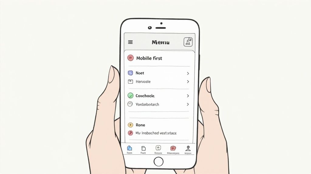
This methodology forces you to prioritize what truly matters. Instead of trying to shrink a complex desktop menu, you build a lean, focused navigation system from the ground up. The Instagram app is a masterclass in this, using a bottom tab bar to place primary actions within easy thumb reach, while Google's mobile-first indexing has made it a crucial ranking factor, directly tying mobile usability to SEO performance.
Why It Matters
A poor mobile navigation experience is a dead end for users. If visitors on a smartphone have to pinch, zoom, or hunt for a tiny menu icon, they will quickly become frustrated and leave. Designing mobile-first directly addresses this by ensuring usability, accessibility, and speed on constrained devices. This improves user satisfaction, reduces bounce rates on mobile, and positively impacts your site's search engine rankings.
"Designing for mobile first not only prepares you for the explosive growth and new opportunities on the small screen but also forces you to focus and prioritize your content." - Luke Wroblewski
Actionable Tips for Implementation
Webflow Tutorial: Styling the Mobile Menu
5. Implement Mega Menus Strategically
For websites with a large number of pages or complex product categories, a standard dropdown can become unwieldy. Mega menus solve this by expanding into a large, multi-column panel that displays extensive navigation options in an organized grid. This approach reveals a significant portion of your information hierarchy at once, allowing users to scan and select their destination without navigating through intermediate pages.
This powerful navigation pattern, popularized by large e-commerce sites like Amazon.com and Etsy.com, transforms the menu from a simple list into a rich, visual guide. By grouping related links under clear headings and even incorporating icons or images, mega menus reduce clicks and make deep content more discoverable, a key component of effective website navigation best practices.
Why It Matters
Mega menus significantly improve the user experience on content-heavy sites by preventing choice paralysis and reducing the "pogo-sticking" effect, where users jump back and forth between pages. They provide a clear overview of your offerings, which can increase user engagement, accelerate product discovery, and guide visitors more effectively through the conversion funnel. When implemented correctly, they are a powerful tool for enhancing usability and information scent.
"Mega menus are the only good type of dropdown menu. They are an excellent design choice for accommodating a large number of options or for revealing lower-level site pages at a glance." - Nielsen Norman Group
Actionable Tips for Implementation
Webflow Tutorial: Building a Custom Mega Menu
6. Search-Integrated Navigation
For content-heavy or product-rich websites, one of the most effective website navigation best practices is to integrate a prominent search function. This approach acknowledges a fundamental user behavior: many visitors arrive with a specific goal and prefer to search directly rather than browse through menus. Placing a search bar in a highly visible location, typically the header, transforms it from a secondary tool into a primary navigation path.
A well-executed search-integrated navigation system doesn't just provide a box to type in; it offers a fast, intelligent, and helpful experience. Industry leaders like Amazon.com showcase this by coupling their search bar with category filters, while Wikipedia.org makes its vast repository of knowledge instantly accessible through a simple, effective search feature in its header. The goal is to empower users to bypass traditional navigation layers and find exactly what they need with minimal effort.
Why It Matters
Failing to provide an efficient search experience can lead to user frustration and site abandonment, especially on e-commerce or large-scale content platforms. An effective search function improves user satisfaction, increases engagement, and can significantly boost conversion rates. It also provides invaluable data; analyzing user search queries reveals user intent, content gaps, and opportunities to optimize your site's information architecture.
"Search is the user's lifeline, their ultimate tool for mastering complex websites." - Jakob Nielsen, Nielsen Norman Group
Actionable Tips for Implementation
Webflow Tutorial: Enhancing Native Search