.png)


What is information architecture: Master its principles to boost UX and SEO
Ever landed on a website and felt completely lost? You click around, desperately trying to find a simple piece of information, but everything feels jumbled and out of place. That frustrating experience is exactly what happens when a site has poor information architecture (IA).
Think of IA as the invisible blueprint for your website. It’s the thoughtful, deliberate structure that organizes all your pages and content, turning a potential digital mess into a clear, intuitive experience for your visitors.
What Exactly Is Information Architecture?
Let's use a real-world analogy. Imagine walking into a massive library. Without the Dewey Decimal System, signs for different sections, or a card catalog, finding a specific book would be a nightmare. You’d wander aimlessly, growing more and more frustrated.
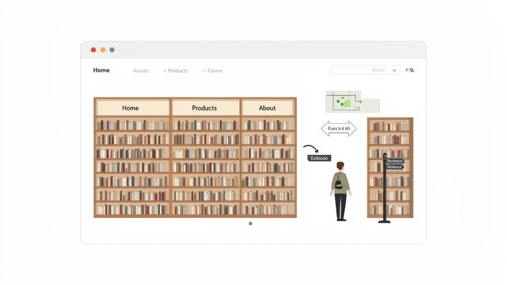
Information architecture is the digital equivalent of that library’s organizational system. It’s the art and science behind structuring your Webflow site’s content so that users instinctively know where to go and what to do. It’s the logic that dictates your navigation menus, page hierarchies, and content categories.
Simply put, information architecture is about making the complex clear. It bridges the gap between your business goals and your user's needs by creating a logical path through your digital content.
Good IA isn't just about a neat and tidy sitemap. It’s about getting inside your user’s head, understanding their expectations, and building a structure that feels completely natural to them.
Why IA Is a Big Deal for Your Webflow Site
For anyone building with Webflow, thinking about IA is non-negotiable. It's the foundation that makes a beautiful design actually work as a high-performing business tool. A solid IA directly fuels success in three critical areas.
- It creates a better user experience (UX). When people find what they need without thinking, they have a positive experience. They stay longer, trust your brand more, and see you as a professional. The reverse is also true—Forrester found that a staggering 88% of users are less likely to return to a site after one bad experience.
- It boosts your SEO performance. Search engines like Google love well-organized websites. A logical structure helps their crawlers understand your content, see how pages relate to one another, and index everything more efficiently. This clarity is often rewarded with better search rankings. If you want to dive deeper, our guide on site architecture for SEO has you covered.
- It drives higher conversion rates. Confusion is the enemy of conversion. Whether you want someone to book a demo, buy a product, or sign up for a newsletter, good IA clears the path. By removing friction and guiding users toward your goals, you naturally lower bounce rates and increase the odds of turning a visitor into a customer.
Ultimately, a strong IA is the unsung hero of a great website. It works quietly in the background, making sure your design, content, and marketing efforts all come together to create an experience that’s not just visually stunning but strategically sound.
Here’s a quick breakdown of how a thoughtful information architecture can transform your Webflow site from a simple online brochure into a powerful business asset.
Why Good Information Architecture Is a Game Changer
BenefitImpact on Your Webflow SiteBusiness OutcomeFindabilityUsers can locate information quickly through intuitive navigation and clear labels.Reduced bounce rates and increased session duration.UsabilityThe site feels easy and logical to use, reducing user frustration and cognitive load.Higher user satisfaction and improved brand perception.SEO AuthoritySearch engines can easily crawl and index your content, understanding its hierarchy and relevance.Improved keyword rankings and more organic traffic.ScalabilityThe structure is flexible enough to accommodate new content and features without breaking.Lower long-term maintenance costs and future-proof design.ConversionsClear pathways guide users toward key actions, like "Contact Us" or "Buy Now."Increased leads, sales, and goal completions.
As you can see, the benefits go far beyond just "being organized." A well-planned IA creates a ripple effect that touches every key performance indicator, from user engagement to your bottom line.
How We Learned to Organize Digital Information
Information architecture isn’t some new-fangled design trend. It’s a discipline that’s been around for decades, long before the first Webflow site ever went live. The core challenge has always been the same: how do you organize a mountain of information so people can actually find what they need and make sense of it all?
Think about it—the principles we rely on today didn't just pop up overnight. They grew out of much older fields like library science. Librarians were the original masters of taming information chaos, and their work laid the groundwork for how we structure digital content today. The goal was, and still is, to make the complex clear.
From Punch Cards to Pixels
The real story of modern IA kicks off in the 1960s and 70s. As early as 1959, you had thinkers at IBM like Lyle R. Johnson and P. Frederick Brook talking about "architecture" in the context of computer systems. They were grappling with how to organize data for the first time.
Then, in the 1970s, the famous research group at Xerox PARC officially coined the term "information architecture." This was a huge step. It marked a shift from just processing data to designing deliberate, user-friendly information structures. It was the moment people realized we needed a blueprint for information.
The Dawn of the Web and the Polar Bear Book
The 1980s kept the momentum going, focusing on designing systems for businesses. This is when we started seeing the early versions of documents we still use today—blueprints, user requirements, and content categories. These are the direct ancestors of the sitemaps and taxonomies we at Block Studio use to fix messy Webflow sites that are killing their SEO.
But the 1990s changed everything. The World Wide Web exploded onto the scene, creating a chaotic "digital wild west" of hyperlinks and endless pages. Suddenly, there was a desperate need for people who knew how to bring order to this chaos.
That’s when two pioneers, Louis Rosenfeld and Peter Morville, stepped in and wrote "Information Architecture for the World Wide Web."
Known by everyone in the industry as the "Polar Bear Book" (for obvious reasons), this guide was a revelation. It gave a whole generation of web designers, developers, and writers a practical toolkit and a common language. It took IA from a niche, academic idea and made it an essential, mainstream practice for building websites that actually work for people.
The "Polar Bear Book" codified the core principles of information architecture, making them accessible and actionable for the first generation of digital creators. It taught us how to organize, label, and create navigation systems for the web.
Knowing this history makes one thing crystal clear: IA isn't a fleeting trend. The challenges of organizing information are universal, whether you're arranging books on a shelf or building a complex Webflow site. Even seemingly different tasks like planning social media content rely on similar principles of structure and clarity. The tools we use today are simply modern solutions to a problem people have been trying to solve for over half a century.
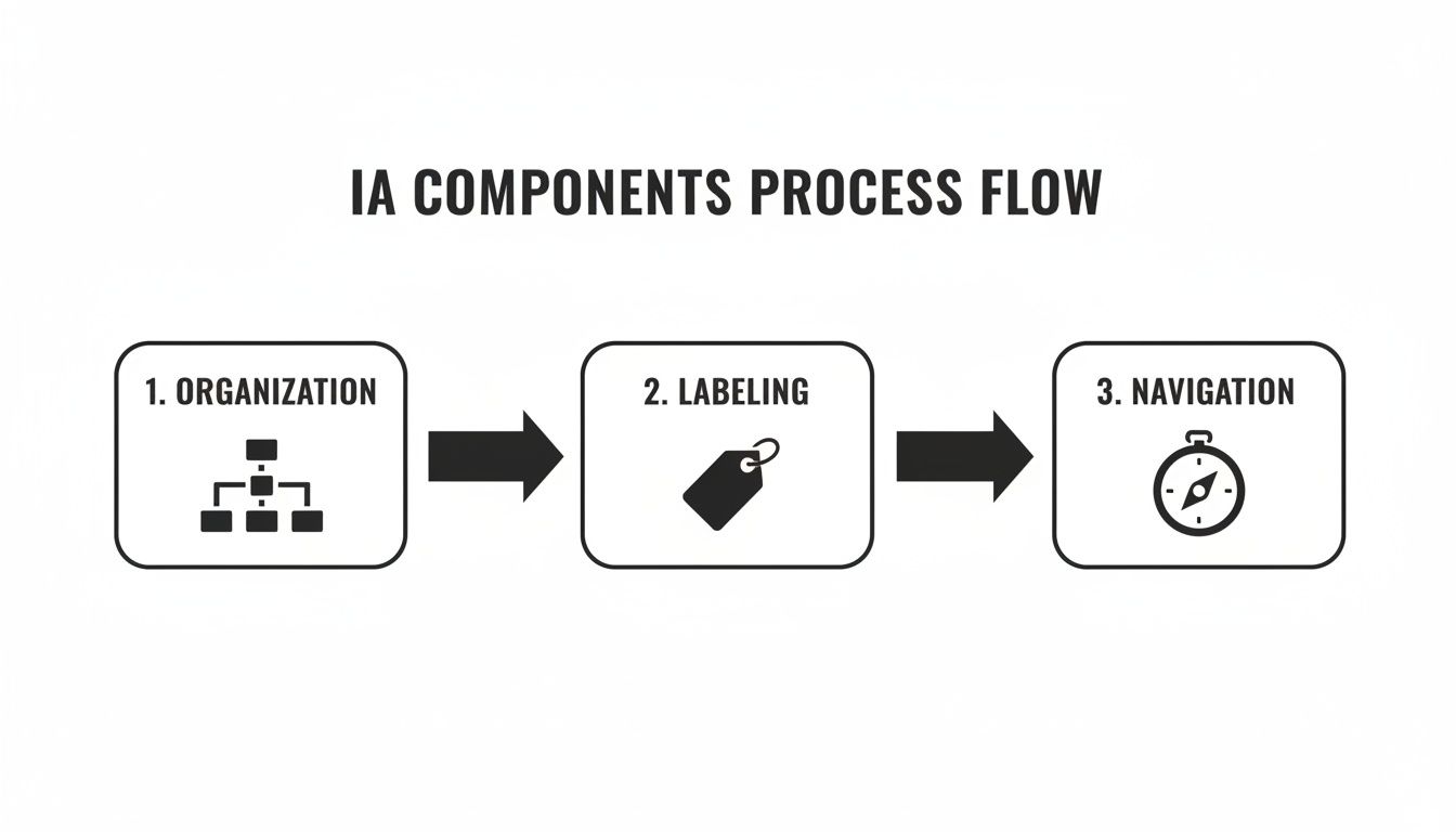
The Four Core Components of Information Architecture
Every solid structure needs a strong foundation, and your website's information architecture is no different. To really get a grip on what information architecture is, you have to understand the four pillars it’s built on. Think of them as the essential ingredients that transform a jumble of pages and content into a website that just makes sense.
If you're building a site in Webflow, getting these four components right is the secret to creating something that not only looks incredible but also works beautifully for both your visitors and search engines. Let's dig into each one.
1. Organization Schemes
First up is organization—the way you group and categorize your content. This is the big-picture blueprint for your entire site. The goal is to create a logical system that feels intuitive to your audience, not just your internal team.
There are a few tried-and-true ways to structure information, and the best one for you will depend entirely on your content and who you're trying to reach.
- Hierarchical: This is the one you’ll see most often. It’s like a family tree or an org chart, starting with broad categories (like "Products") and branching into more specific ones (like "Running Shoes" and "Hiking Boots"). It's a natural fit for most business websites.
- Sequential: This approach organizes content in a step-by-step flow. Think of a course curriculum, a multi-page tutorial, or an e-commerce checkout process. It’s all about guiding the user on a linear path from A to B.
- Matrix: This is a more advanced structure that gives users multiple ways to slice and dice information. Imagine shopping for a laptop and being able to filter by brand, price, and screen size all at once. That's a matrix scheme in action.
- Alphabetical: Simple and effective. This is your go-to for large lists of similar items, like a glossary of terms, a contact directory, or an index.
Choosing the right organization scheme from the start is the first major step in building a solid IA foundation.
2. Labeling Systems
Next, we have labeling. This is all about the words you choose to represent your content. What do you call the links in your menu? What are the titles of your pages? Your labels can either be a guiding light or a source of major confusion.
Good labeling means you’re speaking your customer’s language. Ditch the internal jargon and clever marketing-speak that might sound great in a boardroom but means nothing to a first-time visitor. If someone is looking for costs, labeling a menu item "Investment" is too clever. "Pricing" or "Plans" gets the job done instantly.
Good labeling is empathetic. It requires you to step out of your own perspective and use the exact terms your target audience would use to find what they need.
Consistency here is key. The label in your main navigation has to match the headline on the page it links to. This simple act of alignment tells users they've landed in the right spot and builds immediate trust.
3. Navigation Systems
The third pillar is navigation, which is how people actually move through your site. If organization is the blueprint and labels are the road signs, navigation is the system of pathways connecting everything together. It’s the tangible interface your visitors click, tap, and interact with.
This includes everything from your main menu and footer links to breadcrumbs and internal links within your content. A great navigation system makes it effortless for people to know where they are, where they’ve been, and where they can go next.
A classic mistake is cramming the main menu with dozens of options, which just paralyzes visitors with too many choices. A clean, logical menu helps them make decisions quickly. To learn more about designing a menu that works, check out these essential website navigation best practices. For Webflow users, this means thoughtfully using elements like the Nav Link and Dropdown components to build an intuitive experience from the ground up.
4. Search Systems
Finally, there’s search. For any site with a lot of content, a good search function isn't a "nice-to-have"—it's a necessity. While navigation provides curated paths, search gives users the power to jump directly to what they want using their own words.
But implementing search is more than just dropping a search bar onto your page. You have to design how it works. What content gets searched? How are the results displayed? Can users apply filters? Does it suggest corrections for typos?
Better yet, the data you get from on-site search is pure gold. It tells you exactly what your users are looking for, in their own words, and can shine a light on confusing labels or content gaps you never knew you had. On a complex SaaS site built in Webflow, a powerful search feature can be the difference between a frustrated user and a happy customer.
How to Audit and Improve Your Webflow Site's IA
Turning your Webflow site’s information architecture from a confusing maze into a clear, intuitive path is a hands-on job. It’s not just about aesthetics; it’s about building a foundation that works for your users and your business.
Whether you're looking to overhaul an existing site or starting a new project from scratch, following a clear process is key. Let's get practical and walk through exactly how to build a smarter, more effective digital experience in Webflow.
Step 1: Start with a Full Content Inventory
Before you can organize anything, you need to know what you’re working with. This first step is a content inventory, which is just a fancy way of saying you need to make a detailed list of every single page and asset on your website.
Think of it like taking stock of a retail store before a big reorganization—you have to count everything on the shelves first. While tools like Screaming Frog are great for automating this on large sites, a manual audit often gives you a much better feel for what’s really there, especially for smaller projects. A simple spreadsheet is all you need to track the essentials for each page:
- Page Title and URL: The unique address for each piece of content.
- Content Type: Is it a blog post, service page, case study, or a landing page?
- Metadata: Jot down the current meta title and description.
- Performance Metrics: Pull some basic data from Google Analytics like page views, bounce rate, and time on page.
This inventory gives you a 30,000-foot view of your entire content landscape. To go even deeper and check your site's overall health beyond just its structure, you might find an ultimate site audit checklist helpful.
Step 2: Figure Out How Your Users Think with Card Sorting
Once you know what you have, the next critical step is to find out how your users would organize it. This is where card sorting comes in. It’s a classic user research technique that forces you to step outside your own assumptions and see your site through your audience’s eyes.
The process is simple: write your main pages or content topics on individual cards (physical or digital) and ask a few people from your target audience to group them in a way that feels logical to them. You're trying to uncover their "mental models"—how they naturally categorize information.
You can use digital tools like Miro or Optimal Workshop to run these sessions easily online. After a few sessions, you'll start to see clear patterns emerge, giving you a data-backed blueprint for your site's structure. You might discover category names or groupings you never would have thought of on your own.
Step 3: Map Out Your Structure with a Visual Sitemap
Armed with insights from your inventory and card sorting, it’s time to create a visual sitemap. This isn’t the XML file you submit to Google; it’s a diagram that shows the hierarchy and relationships between all your pages. Think of it as the architectural blueprint for your website.
This blueprint is where the core components of your IA really come together.
Start with your homepage at the very top. Branching down from there are your main navigation categories, and under each of those, you list the subpages. This visual map is incredibly useful for spotting gaps, redundant pages, or pathways that just don’t make sense—before you waste any time building in Webflow.
Step 4: Nail Your Webflow Implementation
Now it’s time to bring that blueprint to life inside Webflow. This is where you translate all your planning into a real, functional website structure.
A well-organized Webflow project is the secret to a scalable and easy-to-manage site. This isn't just about making things look good on the front end; it's about building a logical backend that supports your content now and in the future.
Here’s a practical checklist to guide you through the key audit areas directly within your Webflow project.
Webflow IA Audit Checklist
This checklist will help you systematically review and improve the information architecture of your Webflow site.
By working through this list, you can ensure your site’s structure is not only logical for users but also optimized for search engines and easy for you to manage. It's a win-win-win.
Common IA Mistakes to Avoid on Your Webflow Site
Building a great website isn't just about what you do right; it's about what you don't do wrong. Even the most polished Webflow site can stumble if its information architecture is a mess. By learning to spot these common pitfalls, you can build a site that feels intuitive and performs well from the get-go.
Many of these mistakes look small on their own, but together, they create a mountain of friction. They make it harder for people to find what they need and for search engines to understand your content.
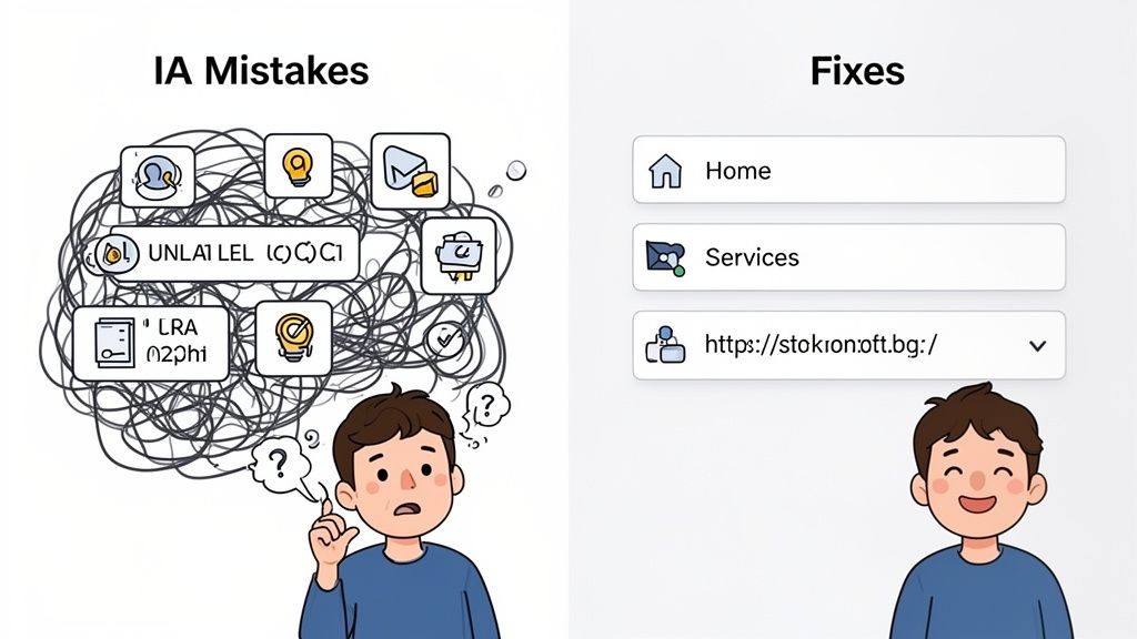
Using Inconsistent or Unclear Labels
One of the quickest ways to confuse visitors is with inconsistent, jargon-heavy labels. You see it all the time: the navigation menu says "Solutions," the page headline says "Our Platforms," and the URL is /services. This forces users to play a guessing game, creating unnecessary mental strain.
The problem is that inconsistent labels shatter a user's mental model of your site. When the words don't match what they expect, they lose confidence and wonder if they're even in the right place. This confusion is a one-way ticket to a higher bounce rate.
The Webflow Fix:
- Be consistent: Make sure the text in your Nav Link element matches the H1 title of the page it links to.
- Use plain language: Save the clever marketing-speak for your copy, not your navigation. If you sell accounting software, label the page "Pricing," not "Your Investment."
Creating a Disorganized CMS Structure
Webflow's CMS is a powerhouse, but without a clear plan, it can turn into a digital junk drawer. A classic mistake is throwing everything—blog posts, case studies, team bios—into a single, generic "Posts" Collection.
This lack of organization creates messy URLs, makes content a nightmare to manage, and kills opportunities for smart internal linking. For instance, you can't easily connect a case study back to the specific service it features if they aren't structured to relate to one another.
A well-structured CMS isn't just for your own convenience. It's a cornerstone of your SEO strategy, creating clean URL paths and enabling the kind of internal linking that shows Google you're an authority on a topic.
The history of organizing information, from 1970s data models to modern IA, proves one thing: structure drives results. Forrester research shows that a staggering 88% of users are less likely to return after a bad experience, and well-designed sites can see 2.5x better conversion rates. For ambitious B2B SaaS founders, sidestepping these mistakes is crucial for turning visitors into leads. You can find more about how data architecture has evolved on dataversity.net.
Neglecting URL Structure and Hierarchy
Another common oversight is ignoring your URL structure, which leads to long, nonsensical, or flat URL paths. A URL like yourdomain.com/post-123 tells users and search engines absolutely nothing about the page's content or where it fits in your site.
Think of a messy URL as a red flag for both people and search engine crawlers. It looks unprofessional and makes it nearly impossible for search engines to map out the relationships between your pages.
The Webflow Fix:
- Use Folders: In the Pages panel, group related static pages into folders. This instantly creates a clean, logical URL path, like
/services/seo. - Customize Slugs: For every single page and CMS item, take a moment to manually edit the slug. Keep it short, descriptive, and keyword-rich. A blog post URL should be
/blog/what-is-information-architecture, not/posts/article-title-with-lots-of-extra-words.
Measuring the Success of Your Information Architecture
So, you’ve put in the work to improve your site's structure. It feels good, but how can you be sure it's actually making a difference? A successful information architecture doesn't just look neat on a Miro board; it needs to deliver real, measurable business results. The trick is to directly link your architectural changes to what users are doing on your site.
This data-driven approach is what separates guesswork from a genuine return on investment. Instead of just hoping your new navigation is better, you can track specific key performance indicators (KPIs) to prove it. By digging into the right data, you can keep fine-tuning your Webflow site for peak performance.
Key Metrics to Track
To figure out if your new IA is pulling its weight, you'll want to look at both quantitative and qualitative data. Think of it this way: tools like Google Analytics give you the hard numbers, while user behavior tools like Hotjar or Microsoft Clarity fill in the "why" behind those numbers.
Here are the essential metrics to keep an eye on:
- Task Success Rate: This is the big one. Can people actually do what they came to your site to do? Set up goals in Google Analytics to track crucial user journeys, like submitting a contact form or finishing a checkout. A jump in goal completions is a fantastic sign that your IA is helping, not hindering.
- Bounce Rate & Time on Page: Are visitors sticking around, or are they hitting the back button almost immediately? A lower bounce rate and a higher average time on page for your core pages suggest that people are finding what they need and your navigation makes sense to them.
- On-Site Search Queries: Your internal search bar is a goldmine. What people type in there tells you exactly what they can't find using your menu. If you see searches for "pricing" drop after you've made the pricing page more prominent in the navigation, that’s a clear win.
This Google Analytics dashboard is a perfect example of how user engagement metrics tie directly back to your site's structure.
When you see a high number of "Views per user" paired with a healthy "Average engagement time," it's a strong indicator that visitors are moving between pages with ease, which is exactly what a good IA facilitates.
Connecting IA to Business Goals
At the end of the day, the success of your information architecture is all about hitting your business objectives. Every metric you track should help answer a critical business question. Are we getting more qualified leads through the site? Are support calls going down because people can now find answers on their own?
A data-informed IA isn't a "set it and forget it" task. It's a continuous cycle of improvement: use your analytics to find the friction, propose a structural fix, and then measure the results.
This loop of measuring and refining is a fundamental part of optimizing a site for both search engines and people. To get the full picture of your site's health, you should fold these IA metrics into a wider review, just like you would when learning how to do an SEO audit. This ensures your site’s foundation is built to support all your growth goals.
Got Questions About Information Architecture? We've Got Answers.
Even after laying out the whole process, it's normal for a few questions to pop up about information architecture. Let's tackle some of the most common ones I hear from clients so you can move forward with confidence on your own Webflow site.
What’s the Real Difference Between IA and UX?
It's a classic question, and here’s the simplest way to think about it: information architecture is the skeleton, and user experience (UX) is the entire living, breathing person.
IA is a critical piece of the UX puzzle. It’s all about how your content is structured, organized, and labeled so people can find what they need. UX, on the other hand, is the sum of all parts—it’s the overall feeling someone gets when they use your site. That includes the IA, but also the visual design, how easy things are to use, and how fast the pages load.
You simply can't have a great user experience without a solid information architecture holding it all together.
How Often Should I Revisit My Site's IA?
You don't need to overthink this and audit your IA every single month. But you definitely can't just set it and forget it, either.
As a rule of thumb, plan on a quick IA review annually. It’s also a smart move to do a check-in whenever you’re about to add a major new section to your site, like a new product line or a whole new blog category. This keeps your site’s structure from becoming a messy afterthought as your business grows.
Can I Fix My IA Without a Total Website Redesign?
Yes, 100%. You don't have to burn the whole thing down and start from scratch to make a real difference. Small, targeted changes can have a huge impact.
Here are a few places to start:
- Tweak your labels: Are your navigation menu items crystal clear? If not, sharpen them up.
- Organize your CMS: A messy backend often leads to a messy front end. Tidy up your Webflow Collections.
- Standardize your URLs: Make your URL slugs consistent and descriptive. It’s a win for both users and SEO.
Making these kinds of smart, incremental adjustments can dramatically improve how easily people find things on your site, proving that good IA is often about evolution, not revolution.
At Block Studio, we don’t just build websites; we build growth platforms. We specialize in creating solid architectural foundations in Webflow that boost traffic and drive real conversions. Ready to see the difference? Turn your website into a revenue engine.