.png)


How to Optimize Images for SEO: A Webflow Masterclass
Optimizing your images is so much more than just dropping a picture onto a page. It's a careful process of picking the right format, shrinking the file for lightning-fast loads, and giving it a name and description that search engines can actually read. Get this right, and your visuals stop being just decoration—they become powerful tools that pull in organic traffic.
Why Bother Optimizing Images on Your Webflow Site?
We all love beautiful, high-impact visuals, but they can be the single biggest drag on your site's performance. More often than not, when a page is slow to load, bloated images are the culprit. Every single image you add to your Webflow project is a chance to either speed things up or slow them down.
And the stakes are higher than you might think. Did you know Google Images is responsible for a whopping 10% of all Google traffic? That's a massive audience you could be tapping into. On top of that, tools like Google Lens are now handling 12 billion visual searches every month. If your images aren't optimized, you're essentially invisible in a huge, growing search arena. You can read more about the rise of visual search on Search Engine Land.
For anyone building with Webflow, getting a handle on this is fundamental. When you optimize your images correctly, you’ll see some major benefits:
- Faster Pages: Properly sized and compressed images mean less data for the browser to download. This directly translates to faster load times and better Core Web Vitals scores, which Google loves.
- Higher SEO Rankings: Page speed is a confirmed ranking factor. But it doesn't stop there. Descriptive file names and alt text give Google crucial context about your content, helping you rank in both regular and image search results.
- A Better User Experience: Nobody waits for a slow website. Fast-loading pages keep visitors happy and slash your bounce rate. Plus, good alt text makes your site accessible to people using screen readers, which is just good practice.
- More Organic Traffic: Showing up in Google Images can bring a whole new audience to your site—people who are looking for exactly the kind of visual content you're creating.
Choosing the Right Image Format
Before an image ever makes it into your Webflow project, you have a crucial decision to make: the file format. This choice is all about striking the perfect balance between image quality and file size. The big three you'll be working with are JPEG, PNG, and WebP.
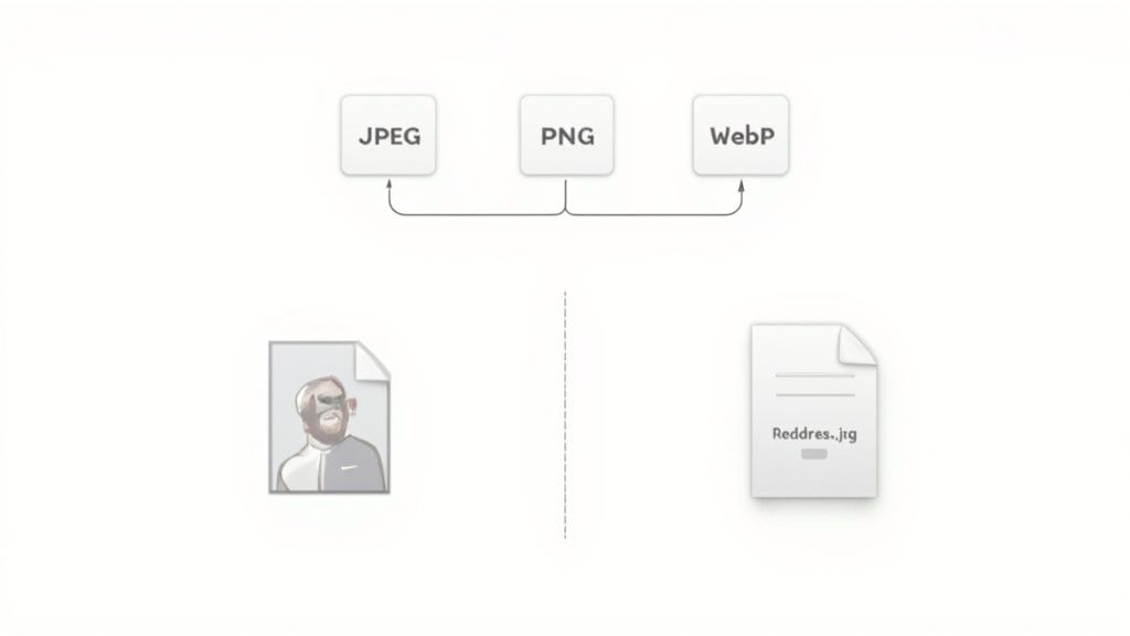
Here's a quick rundown to help you decide.
Choosing the Right Image Format for Webflow
This table is a handy cheat sheet for picking the perfect format. Think about what your image needs to do, and the best option will become clear.
Ultimately, the goal is to get the smallest possible file size without a noticeable hit to visual quality.
JPEG (Joint Photographic Experts Group) has long been the workhorse for photographs. It uses what's called "lossy" compression, meaning it intelligently discards some image data to shrink the file size. For a detailed photo, this trade-off is almost always worth it, as the quality difference is usually invisible to the naked eye.
PNG (Portable Network Graphics) is your specialist. It uses "lossless" compression, keeping every single pixel of the original image. This results in pristine quality but much larger files. The killer feature here is its support for transparency. If you have a logo or an icon that needs to sit on a colored background, PNG is the way to go. Just use it strategically.
But the real game-changer is WebP. This is a modern format developed by Google specifically for the web. It offers fantastic compression that creates files that are typically 25-34% smaller than their JPEG or PNG equivalents, often with no visible quality loss. The best part? Webflow automatically converts your images to WebP and serves them to modern browsers, so you get a massive performance win without any extra work. A great workflow is to upload a high-quality JPEG or PNG and just let Webflow's magic handle the rest.
Taming File Sizes with Image Compression
Let's be blunt: large, unoptimized images are the single biggest performance killer on most websites. When someone visits your page, their browser has to download every last thing, and those beautiful, high-resolution images are often the heaviest items in the suitcase. This creates a massive bottleneck, leading to slow load times that directly sabotage your user experience and, by extension, your SEO.
It’s like trying to download a 4K movie on a shaky 3G connection. It’s painful. Forcing users to wait for huge image files to load is a guaranteed way to make them click the "back" button.
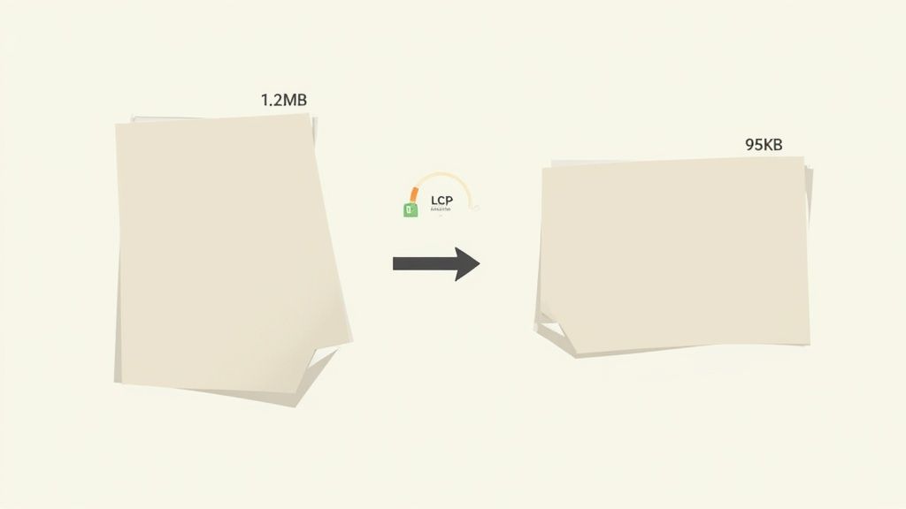
This is where image compression saves the day. It’s the art of strategically shrinking your image file sizes without a noticeable hit to visual quality. Getting this right is absolutely fundamental.
Lossy vs. Lossless: What’s the Difference?
You’ll hear two main terms thrown around when it comes to compression: lossy and lossless. Understanding the distinction is crucial for getting the best results on your Webflow site.
- Lossless Compression: Think of this as a clever packing method. It reduces file size by removing non-essential metadata from the file but doesn't touch a single pixel. The quality stays 100% identical to the original, which makes it perfect for logos, icons, or technical diagrams where every detail is critical.
- Lossy Compression: This approach is more aggressive. It intelligently and permanently removes some pixel data from the image to make the file size drastically smaller. For most photographs and complex visuals, this is your best friend. You can often slash the file size with little to no perceptible drop in quality.
For the majority of photos you’ll use—like hero banners, blog post images, or product shots—lossy compression is the clear winner. It’s not uncommon to see file size reductions of 70% or more, which makes a world of difference for your page speed.
The goal is to find that sweet spot: the file size is as small as possible (I aim for under 150KB) while the image still looks sharp and professional on screen. Don't be afraid to play with compression levels to see how far you can push it for each specific image.
My Go-To Compression Workflow
While Webflow does a pretty great job of automatically compressing images and converting them to the modern WebP format, you get maximum control and the best performance by optimizing them before you upload.
Here’s a simple workflow I’ve refined over the years:
- Resize Dimensions First: Before you even think about compression, get the image dimensions right. There's no point uploading a 4000px wide image for a space that's only 800px wide. Resizing is the single most effective way to cut down file size from the start. A hero image might need to be 1920px wide, but a small inline image can often be much smaller.
- Use a Dedicated Compression Tool: I live by tools like TinyPNG, Squoosh, or ImageOptim. You just drag and drop your resized image, and they work their magic. Squoosh is especially cool because it gives you a live preview, so you can slide the compression level up and down to see the quality change in real time.
- Upload to Webflow: With your newly slimmed-down image, you can now upload it to the Webflow Asset panel. Webflow will take your already-optimized file and serve it efficiently, including its own WebP conversion for browsers that support it.
Beyond these tools, knowing the optimal export settings for various platforms from your photo editing software is a professional habit that pays dividends in quality and performance.
The Real-World Impact on Core Web Vitals
This whole process isn't just about making your site feel faster; it's about improving the concrete metrics Google uses to judge and rank your site. Proper image optimization is a direct boost to your Core Web Vitals.
Your Largest Contentful Paint (LCP), for instance, is heavily influenced by image load times and should ideally be under 2.5 seconds. With mobile traffic now accounting for 62% of all web traffic globally, heavy images are a huge liability. Fast-loading, optimized visuals, on the other hand, can dramatically reduce bounce rates and improve engagement.
Given how critical mobile is, our guide on mobile website optimization offers more strategies to ensure your site is a top performer on any device. By making compression a non-negotiable part of your workflow, you’re not just speeding up a page—you’re creating a better experience for your visitors and sending all the right signals to search engines.
Advanced Webflow Image Techniques for SEO
Alright, let's take your image optimization to the next level, specifically for Webflow. If you've got the basics down, this is where you can really start to pull ahead of the competition by using Webflow's powerful, built-in features to build sites that are not just beautiful, but incredibly fast and search-engine friendly.
One of the most significant wins in modern web performance is making sure you're sending the right-sized image to every visitor, no matter what device they're using.
Responsive Images and srcset: Webflow's Secret Weapon
Ever notice how a website looks just as sharp on a giant 4K monitor as it does on your phone, without making your phone download a massive file? That’s not an accident. The magic behind this is an HTML attribute called srcset.
Essentially, srcset gives the browser a menu of different-sized versions of the same image. The browser then looks at the user's screen size, resolution, and network speed, and picks the most efficient image from the list. This is huge—it stops a tiny mobile device from wasting bandwidth and time downloading a gigantic image it doesn't need.
The best part? Webflow does all the heavy lifting for you.
When you upload a high-quality image into your Webflow project, it automatically creates several smaller versions in the background. You don't have to resize a thing.
Curious to see it in action?
- Publish your Webflow site and open it in Google Chrome.
- Find an image, right-click on it, and hit "Inspect."
- In the code that appears, look for the
<img>tag. You'll find asrcsetattribute filled with links to different image sizes, labeled with their width (like 500w, 800w, 1080w).
That one automated feature is a massive performance boost right out of the box, improving load times for a huge chunk of your visitors without any extra work on your part.
Get a Serious Speed Boost with Lazy Loading
Another game-changer for page speed is lazy loading. By default, a browser wants to download every single image on a page the moment you land on it—even the ones way down in the footer that you might never scroll to. This can bring your initial page load to a crawl.
Lazy loading flips the script. It tells the browser, "Hey, don't bother downloading those images further down the page until the user actually gets close to them." This frees up resources to load the important, "above-the-fold" content first, which can dramatically improve your Largest Contentful Paint (LCP) score.
Enabling this in Webflow couldn't be easier:
- Select any image on your canvas.
- Head over to the Settings panel (the little gear icon).
- Change the "Load" setting from the default "Eager" to "Lazy".
My rule of thumb: Set every image that isn't immediately visible to "Lazy." The only exceptions are crucial images at the very top of the page, like your hero banner. Leave those as "Eager" to make sure they pop in instantly for the best possible first impression.
Give Google a Hand with Image Schema
Ready to get a bit more technical for a serious SEO advantage? Let's talk about structured data, or schema. This is a special vocabulary you can add to your site's code to give search engines a much deeper understanding of your content.
By using ImageObject schema, you're spoon-feeding Google all the important details about your images: the URL, its dimensions, a title, and a caption. This makes your images eligible for those eye-catching "rich results" in Google Search and Google Images, helping them stand out from the crowd.
Here's a practical way to add ImageObject schema for your Webflow blog posts.
Step 1: Add Custom Fields to Your CMS
First, jump into your "Blog Posts" collection settings. You'll need to add two new Plain Text fields:
Image Width (pixels)Image Height (pixels)
Now, whenever you upload a main image for a blog post, just pop its dimensions into these fields.
Step 2: Drop the Schema Code into Your Page Settings
Next, go to your Blog Post template page. Open the page settings and find the custom code section for the </body> tag. Paste this JSON-LD script inside:
<script type="application/ld+json">{"@context": "https://schema.org","@type": "ImageObject","contentUrl": "ADD MAIN IMAGE FIELD HERE","name": "ADD ALT TEXT FIELD HERE","width": "ADD IMAGE WIDTH FIELD HERE","height": "ADD IMAGE HEIGHT FIELD HERE","caption": "ADD IMAGE CAPTION FIELD HERE"}</script>Step 3: Connect Your CMS Fields
The final step is to bring it all together. Click on the placeholder text in the code (like "ADD MAIN IMAGE FIELD HERE") and use the + Add Field button to link it to the corresponding dynamic field from your CMS. This automatically pulls the right image data for every single blog post.
By putting these advanced techniques to work, you're doing more than just basic image optimization. You're building smarter, faster websites that give search engines every possible reason to rank you higher.
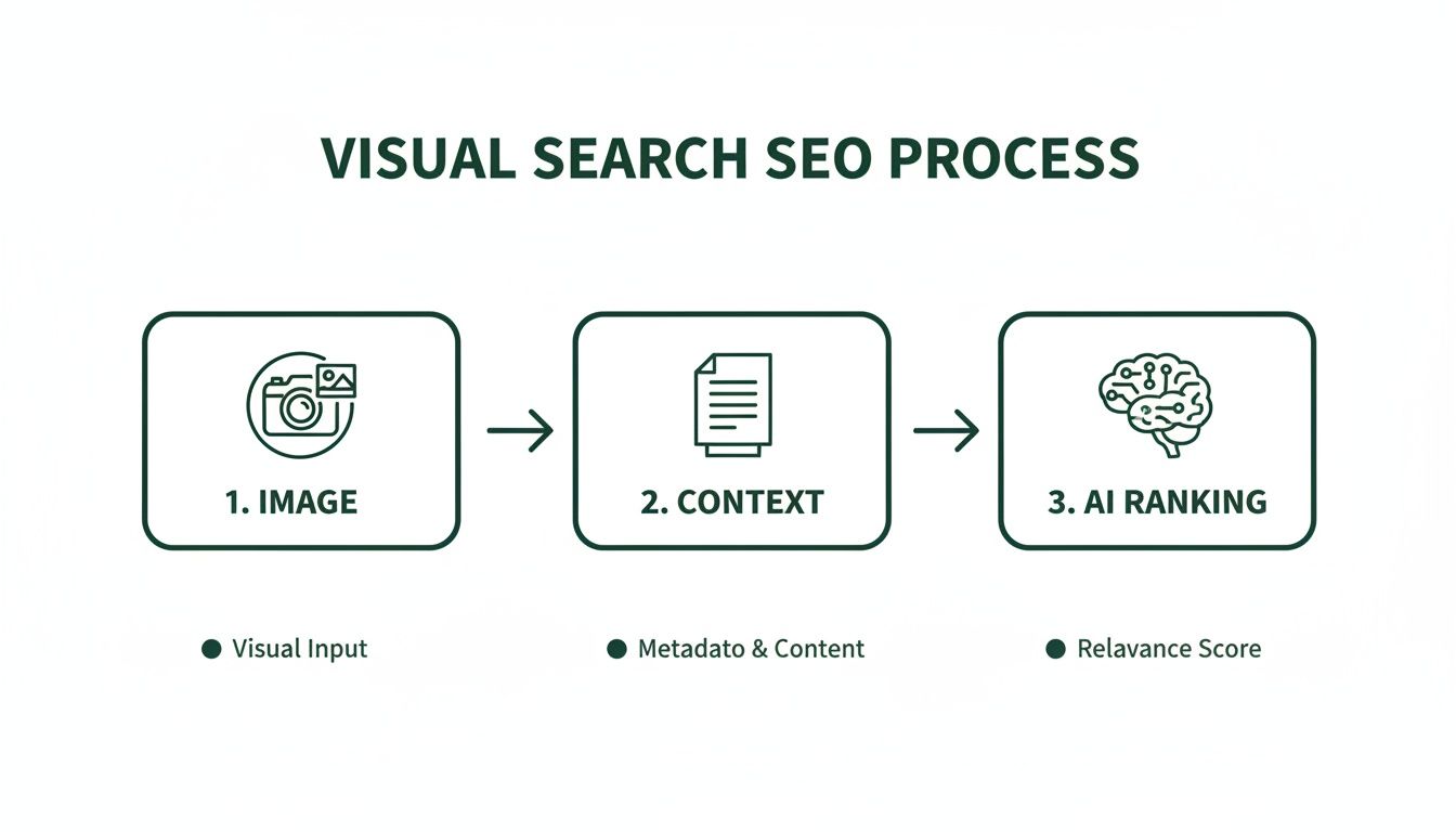
Optimizing for Visual Search and AI Discovery
The days of just worrying about ten blue links are long gone. Search is becoming a much more visual, interactive experience, and the AI-driven tools behind it are fundamentally changing how people find information. If you're not optimizing your images for this new reality, you're leaving a massive amount of traffic on the table.
This shift toward visual search isn’t some fringe trend; it's a seismic change. Just look at the numbers. Google Lens is used by over 1.5 billion people every month, powering more than 100 billion visual searches. With smartphones accounting for 62.73% of all website traffic, visual discovery has become a primary way people explore the web. You can dig into more of these eye-opening SEO stats on Backlinko if you want the full picture.
Getting your images ready for these tools is about more than just alt text. It’s about making them semantically rich so they can show up in AI-powered features like Google Discover and AI Overviews.
Building a Rich Semantic Environment
Search engines are incredibly smart, but they don't see images like we do. They rely on the context you provide—the words on the page—to figure out what an image is about. This means your headings, your paragraphs, and even your captions play a huge role.
Let’s say you have a great photo of a modern, minimalist desk setup on your Webflow site. Here’s how you’d build that rich context around it:
- Set the stage with a heading: An
H2orH3like "Crafting the Perfect Minimalist Workspace" tells search engines exactly what this section is about. - Use descriptive paragraphs: The surrounding text should dive into related topics—minimalist design, productivity hacks, maybe even the specific gear on the desk.
- Write a specific caption: Don't just label it "Desk." A caption like, "A clean oak desk paired with an ergonomic chair creates a focus-friendly environment for deep work," adds layers of relevant detail.
All this surrounding text creates a strong "scent" of related concepts, giving Google and other AI systems the confidence to match your image to a user's search. It's a simple but powerful way to align your visuals with what people are actually looking for.
How AI Analyzes Your Visuals
Today's AI is remarkably sophisticated. It can look at a photo and identify individual objects (a laptop, a coffee mug, a plant), interpret the overall scene (an office, a cafe), and even read text printed within the image. This has huge implications for how you should be choosing your visuals.
To really grasp how this technology is evolving, it’s worth exploring guides on topics like AI for photography, which break down both the creative and technical sides.
Because AI can "read" your images so well, your visuals need to be genuinely relevant. If you're writing about financial planning for millennials, a photo of diverse young professionals collaborating makes far more sense than a generic stock photo of a piggy bank. The AI will recognize the people, their modern attire, and the collaborative setting, all of which reinforce the actual theme of your content.
Key Takeaway: Always choose images that visually echo the core message of your content. AI cross-references the visual elements in the photo with the surrounding text, and a strong match sends a powerful signal of relevance and authority to search engines.
This deep level of analysis is central to how search works now. It's all part of the indexing process, where search engines organize information to understand it better. For a deeper look at this crucial step, check out our guide on what is website indexing and why it's so important for your site's visibility. When you optimize both your text and your images together, you give your content the best possible shot at being indexed correctly and shown to the right audience.
Nailing Your Webflow Image SEO Workflow
Knowing the "what" and "why" of image SEO is one thing, but consistently putting it into practice is what really moves the needle. This is where we shift from theory to action. I'm going to walk you through the exact, repeatable workflow I use for my Webflow projects to make sure every single image is an asset, not an anchor.
Making this a habit doesn't have to be a drag. Once you get the hang of it, this process becomes second nature, ensuring every visual you add is pulling its weight for both page speed and search rankings.
Think about it this way: search engines are getting smarter every day. They don't just see a picture; they see a web of contextual data points that help them understand what the image is about and why it matters.
As you can see, the text and structured data surrounding your image are just as critical as the image file itself. Your workflow needs to account for all of it.
The Pre-Upload Checklist: Your Local Machine Prep
Honestly, most of the heavy lifting happens before an image ever makes it into your Webflow asset panel. Getting this part right saves a ton of time and prevents performance nightmares down the road. Skipping these steps is a classic rookie mistake.
Here’s what I do on my computer for every single image:
- Right-Size It: Never, ever upload a 5MB photo straight from your camera. Figure out the largest container it will live in on your site—maybe 1920px for a full-bleed hero or 800px for a blog post—and resize it to those dimensions. This one action has the biggest impact on file size.
- Compress Smartly: Once it's resized, run it through a compression tool. My go-to is Squoosh because the live preview lets me dial in the perfect balance of quality and size. TinyPNG is another fantastic option for quick, no-fuss compression. Your goal is to get that file under 150KB (ideally under 100KB) without making it look pixelated.
- Name It Properly: Ditch
IMG_7892.jpg. Rename it to something that actually describes the image and includes your target keyword, likewebflow-seo-agency-client-results.jpg. Always use hyphens to separate words—it's the universal standard for search engines.
Key Takeaway: This pre-upload routine is the foundation of solid image SEO. It directly improves your Core Web Vitals, especially Largest Contentful Paint (LCP), because you're forcing the browser to download less data. Don't skip it.
On-Page Optimization: Working Inside the Webflow Designer
With your perfectly prepped image file ready to go, the next phase is all about giving it context inside Webflow. This is where you tell Google exactly what the image is about and how it fits into the rest of your page content.
Here’s the drill once you're in the Designer:
- Add it to your assets. Simply drag your optimized image into the Webflow Assets panel. Behind the scenes, Webflow works its magic, automatically creating responsive
srcsetversions and serving the file as a next-gen WebP to browsers that support it. - Write meaningful alt text. This is non-negotiable. Click the image on your canvas, head to the Image Settings panel, and fill out the "Alt text" field. Be descriptive. Instead of "graph," write something like, "Bar graph showing a 145% increase in organic traffic for our client, Block Studio." This is a huge win for both SEO and accessibility.
- Set lazy loading. For any image that isn’t visible right when the page loads (anything "below the fold"), find the "Load" setting in the Image Settings panel and switch it to Lazy. This is a game-changer for initial page speed. For your main hero image at the top of the page, leave it set to Eager so it loads immediately.
To make this even easier, here's a checklist you can reference every time you work with images in Webflow.
The Ultimate Webflow Image SEO Checklist
Follow this simple checklist before and after uploading images to your Webflow project to ensure every visual is fully optimized for speed and search visibility.
By turning these steps into a consistent habit, you're not just adding images to a page; you're building a more performant, visible, and accessible website one asset at a time.
Common Image SEO Questions for Webflow Users
Even with a solid workflow in place, certain questions always seem to pop up when you're deep in the weeds of optimizing images in Webflow. Let's tackle a few of the most frequent ones I hear from clients and colleagues.
Does Webflow Automatically Compress Images?
Yes, and honestly, it does a pretty good job. When you upload an image, Webflow gets to work creating responsive variants, converting them to the speedy WebP format for modern browsers, and applying its own compression algorithms.
That said, for top-tier performance, you should absolutely compress your images before you upload them. Relying only on Webflow’s magic can still leave some performance on the table, especially with detailed, high-resolution photos. A quick run through a tool like Squoosh before uploading gives you the final say and ensures your files are as lean as possible.
What Is the Ideal Image Size for a Webflow Website?
This is the classic "it depends" scenario, but I can give you a solid rule of thumb: aim to keep your final image file size under 150KB.
When it comes to dimensions, think about the image's role on the page.
- Full-Width Hero Images: For those big, impressive banners at the top of a page, a width of around 1920 pixels is a safe bet. This keeps them looking sharp on most desktop screens without being overkill.
- Blog Post or In-Content Images: These images are usually constrained by the width of the text column. They rarely need to be wider than 800 to 1200 pixels. Uploading a 4000px image for a space that’s only 800px wide just wastes your visitor’s data.
My advice? Always resize your images to their maximum required dimensions before you even think about compressing and uploading.
How Do I Add Alt Text to Background Images in Webflow?
Here's the short answer: you don't. And that's actually the correct way to handle it.
From both a web development and SEO perspective, CSS background images are considered purely decorative. They don't have an <img> tag in the HTML, which is the necessary home for alt text.
Key Takeaway: Search engines like Google know that background images are for design flair, not for content. If an image conveys important information or adds context to the page, it needs to be a standard
Imageelement placed from the Webflow Add panel. Only then can you give it the meaningful alt text it deserves.
Should I Enable Lazy Loading on All My Images?
You should enable lazy loading on most images, but definitely not all of them. It's a fantastic feature that dramatically improves initial page load times by deferring the loading of images that aren't in the viewport yet.
The rule is simple: use lazy loading for any image that is "below the fold"—anything a user has to scroll to see.
However, for those critical, above-the-fold images (like your logo or main hero image), you should set the "Load" setting to Eager. This tells the browser to load them immediately, which is vital for a good Largest Contentful Paint (LCP) score—a huge factor in Google's Core Web Vitals.
Spotting these kinds of performance wins is exactly what a good site check is for. If you want a structured way to find these opportunities, our guide on how to do an SEO audit offers a complete framework to help you pinpoint and resolve these issues across your site.
At Block Studio, we turn Webflow sites into powerful growth engines by combining expert design, development, and SEO. If you're ready to transform your website's performance and drive real revenue, let's connect.