.png)

Website Accessibility Best Practices Guide
Website accessibility best practices are the guidelines that ensure every visitor—including people with disabilities—can use your site. Adhering to these principles boosts usability, SEO, and protects against legal risks.
Why Website Accessibility Best Practices Matter
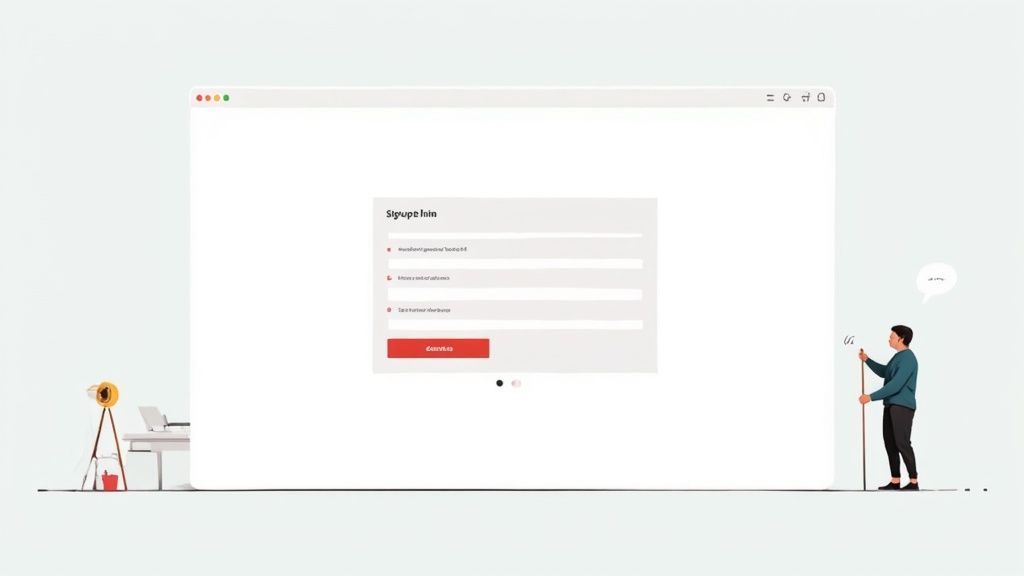
Picture a blind user faced with a contact form that relies solely on placeholder text for guidance. They have no clear labels, so they end up guessing and often giving up. This barrier excludes around 1.3 billion people worldwide.
- Enhanced Reach: Unlock access for 1.3 billion potential users by clearing interaction hurdles.
- Legal Protection: Meeting ADA and WCAG standards reduces the risk of lawsuits.
- SEO Advantage: Semantic markup and cleaner code tend to rank higher in search results.
- Brand Trust: Demonstrating inclusivity builds loyalty and strengthens your reputation.
Overlooking accessibility can lead to fines and lawsuits, sometimes costing up to $50,000 per incident.
Search engines favor pages built with clear, semantic HTML—making accessibility and SEO natural allies.
Sites designed for everyone see higher engagement and lower bounce rates, as more visitors complete key actions.
Yet audits of top websites tell a stark story: 94.8% of homepages on the world’s top 1,000,000 sites have detectable WCAG failures, averaging 51 errors per page. That gap could be costing businesses an estimated $6.9 billion in annual revenue. For more details, explore website accessibility failures.
How This Guide Works
We’ve split this guide into focused chapters, each tackling a core accessibility topic with clear analogies and step-by-step examples.
- Explaining WCAG fundamentals through relatable, real-world metaphors.
- Highlighting high-impact fixes that deliver quick wins.
- Offering ready-to-paste Webflow code snippets for seamless integration.
- Blending automated scans with manual testing in your QA workflow.
- Maintaining a living checklist for ongoing accessibility upkeep.
This approach equips your team with practical know-how to build sites that welcome every user—and strengthen your bottom line.
Inclusivity is not just compliance; it’s a business advantage and a moral duty.
Let’s jump in and start crafting a more welcoming web experience.
Key Terms Explained
Alt text provides descriptive context for images, so screen readers can convey visual information to users with low vision.
ARIA labels add clarity to custom or dynamic controls when native HTML attributes aren’t sufficient.
Keyboard navigation ensures that users relying on keyboards instead of a mouse can fully engage with all interactive elements.
Now you’re ready to dig deeper.
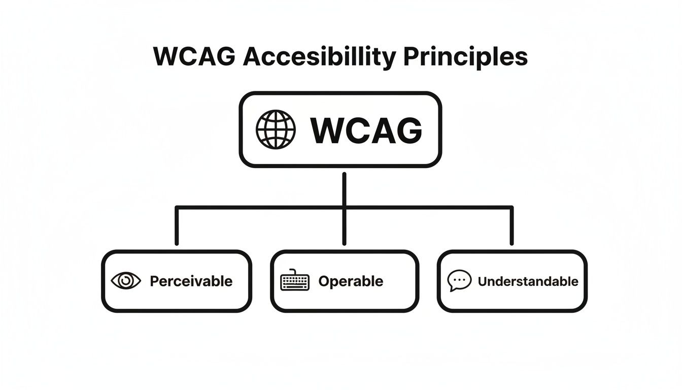
Understanding Key Concepts For Website Accessibility
Building a shared vocabulary around accessibility lays the groundwork for designs that include everyone. By using everyday analogies and hands-on examples, we bring WCAG principles from theory into real-world practice.
Perceivable Principle Explained
Perceivable means your content reaches all senses. Think of alt text as an audio description track at the cinema—it fills in details when visuals alone aren’t enough.
Touch targets must be large enough to prevent mis-taps. A 44×44 pixel button mirrors the familiar tap area on mobile apps, reducing frustration for users with motor challenges.
On smaller screens, scalable text and clear labels ensure assistive tools don’t lose context. This approach keeps your content accessible, no matter the device size.
- Perceivable: Content available in multiple formats
- Operable: Interactive elements usable via keyboard and assistive tech
- Understandable: Navigation and language feel intuitive
- Robust: Code compatible with current and future tools
- Ensure text can resize up to 200% without loss of content or functionality
Operable Principle In Practice
Operable design guarantees everyone can navigate without hurdles. Keyboard shortcuts, for example, act like a backstage pass to your site’s features.
Voice control mapping links spoken commands to meaningful labels and roles. Yet, 94% of mobile sites miss WCAG 2.2 AA standards, leaving 79% of device-dependent users stranded on tiny buttons and hidden menus. Discover more insights about mobile accessibility failures
Accessibility starts when every user can reach and operate features without barriers.
Understandable Content And Navigation
Understandable design removes confusion at every step. Consistent menus become a reliable map, helping visitors know exactly where they are.
Clear error messages act like helpful road signs, guiding users back on track. Keep labels simple, headings descriptive, and offer examples whenever a form field could cause doubt.
- Use straightforward labels for all form fields
- Chunk information with descriptive headings
- Provide examples or tooltips for complex inputs
Understanding Robustness And Mobile Interactions
A robust website adapts to any browser, assistive tool, or future update. Pair that with mobile-first thinking, and your layouts stay flexible, no matter how users connect.
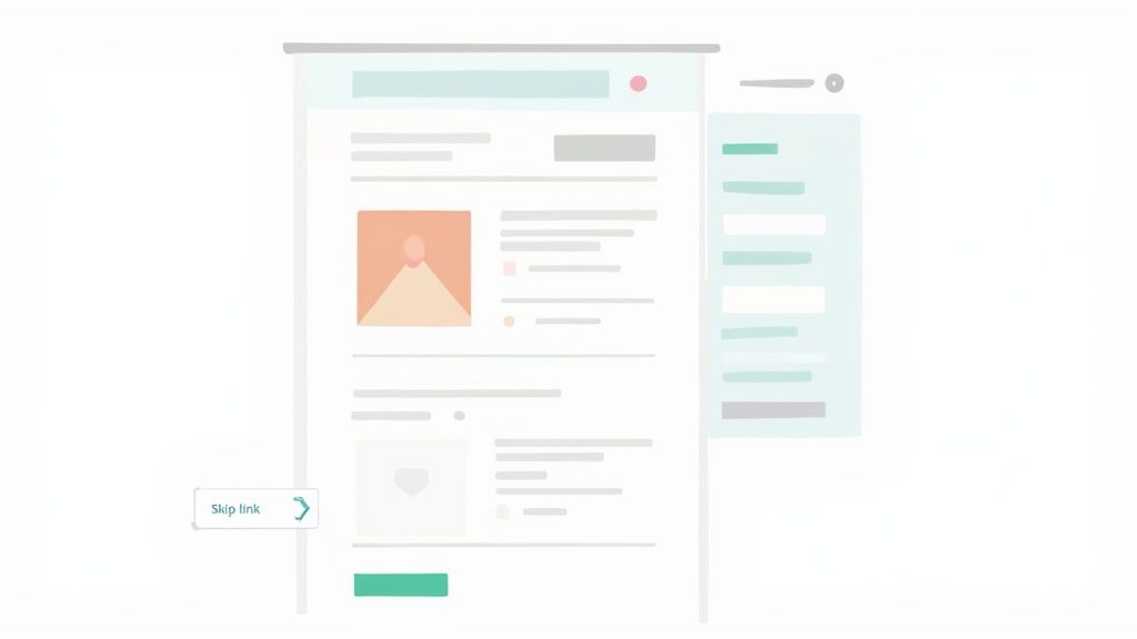
Testing with screen magnifiers, voice commands, and keyboard-only navigation uncovers real-world quirks. Adding a skip link at the top of each page lets keyboard and screen reader users bypass repetitive menus.
- Screen readers like NVDA and VoiceOver
- Screen magnifiers such as ZoomText
- Switch controls for limited-mobility users
Real-user testing often reveals edge cases and builds empathy for diverse needs. With these core concepts in place, you’re ready to implement accessibility best practices in your Webflow projects.
Next, we’ll tackle prioritized fixes that deliver quick, measurable impact. In the meantime, complement these techniques with strong Read more about site structure and SEO practices.
Prioritized Accessibility Best Practices You Need To Know
When you’re pressed for time, zeroing in on fixes that deliver the biggest payoff is essential. By ranking improvements based on user benefit and development effort, teams can check off real milestones and build momentum. For anyone managing a Webflow site, these are the four changes to tackle first.
- Meaningful Alt Text (WCAG 1.1.1) ensures every image tells its story to screen reader users.
- Proper Color Contrast (WCAG 1.4.3) makes body text crisp and readable for those with low vision.
- Robust Keyboard Navigation (WCAG 2.1.1) lets people move through your site without ever touching a mouse.
- Correct ARIA Usage (WCAG 4.1.2) gives custom controls clear roles and states for assistive tools.
Meaningful Alt Text
Think of alt text as a quick audio caption for visuals. It’s not about describing every pixel, but about conveying purpose. A well-crafted alt attribute can turn a blind spot into meaningful context.
- Audit all images in your Webflow CMS and fill in the “Alt Text” field.
- Use clear phrases like “Company logo in navy on white background.”
- Skip vague words such as “image” or “graphic.”
To verify your work, disable images in the browser and listen for meaningful descriptions. You can also check out our guide on website navigation best practices here.
Proper Color Contrast
Imagine squinting at a menu under dim lighting. That’s what poor contrast feels like for someone with low vision. A minimum ratio of 4.5:1 for body text is your baseline.
- Run comparisons in the WebAIM Contrast Checker.
- Preview combinations with Webflow’s Color Picker.
- Automate scans using Chrome accessibility extensions.
Document your color tokens in the design system so future updates stay on track.
Comparison Of Accessibility Best Practices By Impact
Before moving deeper, let’s see how these four priorities stack up side by side. This snapshot highlights which fixes give you the most bang for your buck.
Best PracticeWCAG CriteriaUser ImpactEase Of ImplementationMeaningful Alt Text1.1.1Screen reader users gain contextLowProper Color Contrast1.4.3Low-vision users read text easilyMediumRobust Keyboard Navigation2.1.1Keyboard-only users navigate fullyMediumCorrect ARIA Usage4.1.2Custom controls announce stateHigh
This table should help you decide which items to prioritize in your sprints and which require more planning.
It’s worth noting that late enforcement of Europe’s Accessibility Act led to Germany’s first €50 000 fine, and studies show 71% of disabled users abandon inaccessible sites instantly. Discover more insights about accessibility impact on web use
Robust Keyboard Navigation
Think of a well-designed keyboard flow like a perfectly mapped subway system. Every station (or focusable element) should be reachable in logical order.
- Ensure native elements follow a linear tab sequence.
- Add “Skip to Content” links to bypass repetitive navigation.
- Style focus indicators with clear outlines or color shifts.
Automate keyboard tests with Puppeteer or Selenium, then run manual checks on both staging and live environments.
Correct ARIA Usage
ARIA is essentially stage directions for assistive technology, but only when native HTML falls short. Overusing ARIA can confuse screen readers just as much as underusing it.
Toggle Notifications
Proper ARIA usage unlocks interactive features for everyone and prevents confusion for screen reader users.
In Webflow’s Custom Attributes panel, you can add roles, states, and properties directly to any element.
- Use
aria-liveto announce updates in real time. - Tag mandatory fields with
aria-required="true". - Verify your ARIA markup using WAVE or similar browser extensions.
How To Build On These Wins
Once these four practices are in place, turn your attention to the next set of priorities:
- Label form controls and clarify error messages.
- Implement live regions for dynamic content.
- Test thoroughly with screen readers like NVDA or VoiceOver.
By integrating these tasks into your sprint backlog, you’ll maintain clear visibility and accountability. Start applying these changes today and watch your Webflow site become more inclusive—one update at a time.
Implementing Accessibility In Webflow Projects
Improving your site’s accessibility starts right inside the Webflow Designer. You don’t need to be a specialist—just follow hands-on steps to add meaningful alt text, label your forms, and fine-tune navigation for everyone.
Soon, you’ll see how these simple tweaks in the Designer translate into a smoother experience for users relying on screen readers, keyboards, or other assistive tools.
- Use Webflow’s CMS Alt Text field to describe images in context
- Focus on an image’s purpose, not every visual detail
- Turn off images in your browser to verify clarity
- Cross-reference performance with our image SEO tips below
Writing Descriptive Alt Text
Think of alt text as a narrator painting a scene for someone who can’t see the page. In Webflow, open your Collection settings and fill the Alt Text property with concise, purposeful descriptions.
This step ensures that when a screen reader hits an image, it shares exactly what matters—no guesswork. With the right wording, everyone gets the same context, whether they’re visually browsing or listening along.
Labeling Form Fields
Properly linked labels make form fields a breeze for assistive software. Inside the Designer:
- Drag in a Form Label element
- Set its
forattribute to match the input’s ID - Confirm the link so screen readers announce it clearly
This small connection prevents confusion when users navigate fields by sound or keyboard.
This view shows how labels and alt text settings sit side by side with your layout controls—perfect for a quick check before publishing.
Building Keyboard Friendly Menus
Keyboard navigation depends on logical tab order and visible focus cues. In Webflow, use interactions to:
- Define a clear Tab Index that follows your visual layout
- Add ARIA attributes to your dropdown menus
- Style focus states with outlines or color changes
Then test across desktop and mobile keyboards to make sure focus never gets trapped or lost.
Injecting Skip Links And Focus States
Skip links give users a fast lane to main content. Add this in your site’s head using the Custom Code panel:<a href="#main-content" class="skip-link">Skip to main content</a>
Hide it visually until it receives focus, then style that state in the Designer to meet WCAG 2.1 contrast guidelines. Adjust button and link outlines so they stand out.
"Accessible skip links and strong focus indicators are non-negotiable for keyboard navigation." – Webflow UX Expert
After implementing, publish to staging and navigate by keyboard. Make sure each link and button lights up in the order you expect.
Tutorial: Creating a Custom Skip Link in Webflow
- Step 1: In Project Settings > Custom Code > Head, paste:
<a href="#main-content" class="skip-link">Skip to Main Content</a> - Step 2: In the Designer, style
.skip-linkasposition: absolute; left: -999px;and on:focusbringleft: 10px; top: 10px;. - Step 3: Add
id="main-content"to your main content wrapper in the Navigator. - Step 4: Publish and test by tabbing—skip link should appear and jump to main content.
Tutorial: Building an Accessible Dropdown Menu
- Step 1: Wrap the trigger in a Button element, then add
aria-haspopup="true"andaria-expanded="false"via Custom Attributes. - Step 2: Place your submenu items in a Div Block, set to
display: none;initially. - Step 3: Create a Toggle Click Interaction: on open, set
aria-expanded="true"on the button and show the submenu; on close, reverse. - Step 4: Add
tabindex="0"to submenu links and style a clear focus outline. - Step 5: Publish and test with keyboard—trigger opens submenu, arrow keys navigate items.
You might be interested in image handling techniques to maintain performance and SEO. Check out our guide on optimizing images for SEO for detailed tips.
Verifying Changes In Staging
Before you push live, verify everything on your staging domain:
- Run a Lighthouse audit and aim for a score above 90
- Test with NVDA on Windows and VoiceOver on macOS
- Navigate each page for at least 30 seconds using only your keyboard
- Gather feedback from colleagues and actual assistive-tech users
Document any issues, then update your Webflow Style Guide with focus-state patterns. Share these insights on your project board so stakeholders stay in the loop.
By baking these accessibility checks into your Webflow workflow, you catch problems early and reduce costly rework. The result? A site that aligns with WCAG standards, delivers an inclusive experience, and even boosts SEO, engagement, and satisfaction metrics across the board.
Establishing A Testing And QA Workflow
You want a setup that spots accessibility gaps long before your site goes live. Catching those issues early means fewer curveballs—and budget overruns—after launch.
In this section, we’ll weave automated checks like axe CLI and Lighthouse into your Webflow pipeline. Then we’ll layer in manual audits and genuine user sessions to surface what no bot can detect.
Automated Testing With CLI Tools
Think of these scans as a pre-flight inspection. They flag structural hiccups before a single line of CSS ever ships.
For example, axe CLI highlights missing labels, color-contrast failures, and ARIA misuse right in your staging environment.
- Install via npm or yarn:
npm install -g axe-core - Plug in Lighthouse checks with
lighthouse-ciin your build scripts - Define performance thresholds so pull requests fail on regressions
- Send automated reports to Slack or your ticketing board
Together, these steps make it easy to maintain at least a 90 accessibility score on every pull request.
Manual Audits With Screen Readers
No automated tool catches everything. In fact, scans miss about 30% of tactile or context-driven issues.
Manual testing mirrors real browsing journeys. Fire up VoiceOver on macOS or NVDA on Windows and go hands-on.
- Navigate with Tab and arrow keys alone
- Listen for correct alt text, labels, and live region updates
- Use a screen magnifier to inspect focus outlines
- Note any odd tab stops or unreadable elements
“Manual testing uncovers real user pain points that automation overlooks.” – Accessibility Lead at Block Studio
Trying this across different browsers and assistive technologies uncovers hidden obstacles.
Real-User Testing Sessions
Nothing exposes edge cases like actual people with real needs. Recruit volunteers, give them clear tasks, and watch how they tackle forms or navigation.
- Ask users to complete key tasks (e.g., form submission)
- Record screen and audio for later review
- Collect comments on clarity, wording, and overall flow
- Feed insights back into your next sprint
These sessions build empathy and surface nuances no checklist can predict.
Accessibility Testing Tools And Features
Here’s a side-by-side look at popular accessibility testing tools, their key features, and integration options to streamline your QA process.
Pick the mix that fits your team’s technology and workflow complexity. A balanced toolkit prevents blind spots in your QA process.
Logging Issues And Ticketing
Once a scan or audit turns up a snag, you need a clear path to resolution. Use your ticketing system to capture every detail.
- Create issues in Jira or Trello with reproduction steps
- Tag severity based on WCAG level and user impact
- Attach screenshots or code snippets for context
- Align due dates with your sprint timeline
Consistent labels like accessibility or keyboard help you filter and prioritize work.
Continuous Monitoring And Alerts
Accessibility isn’t a one-and-done task. Ongoing checks guard against regressions and keep everyone focused.
- Run daily Lighthouse audits on staging or production
- Schedule weekly axe CLI reports and compare the results
- Set up Slack or email alerts for score drops or new errors
- Archive past reports to track improvements over time
Bring these metrics into your daily standup to ensure nothing slips through the cracks. Automation paired with regular reviews keeps your site inclusive—and your team confident.
A mature QA workflow blends automated scans, manual reviews, and real-user feedback to deliver an accessible experience every time. In the next section, we’ll craft a living, practical accessibility checklist for your team.
Creating A Practical Accessibility Checklist
An accessibility checklist acts like a roadmap for your entire project—from initial sketches all the way to ongoing updates.
By breaking tasks into phases, teams can catch issues early and avoid scrambling at the last minute.
Think of it as a pre-flight safety list: nothing takes off until every item is signed off. Assign each task an owner, set clear deadlines in your project tool, and schedule regular reviews. This level of transparency keeps everyone on the same page about WCAG compliance and website accessibility best practices.
To simplify, we’ve organized the checklist into four phases. Each section outlines the critical checks and hands-on steps you can use in Webflow or any CMS.
Checklist For Design Phase
- Semantic HTML Verification
Use<h1>–<h6>tags in order. This clear hierarchy helps screen readers navigate content the way chapter titles guide you through a book. - Color Contrast Evaluation
Measure background and text contrast with WebAIM’s tool. Strive for at least 4.5:1 on body text and 3:1 on larger headings. - Alt Text Planning
Add descriptive alt text in your wireframes. Focus on meaning—write “Office Locations Map” instead of “green map.” - Focus Indicator Sketch
Design a standout focus style—whether it’s a thick outline or a bold color shift. Include it in your style guide so developers can follow it consistently. - Skip Link Prototype
Create a hidden “Skip to Main Content” link that appears on keyboard focus. Make sure its colors meet WCAG 2.1 contrast standards. - Form Label Layout
Place a<label>tag above each input in your mockups. This visual layout helps content editors add the correct labels later.
“Design work laid out through a checklist cuts down rework by 30%.”
Checklist For Development Phase
- ARIA Role Assignment
Only sprinkle inroleandaria-*attributes when native HTML can’t deliver. For instance, userole="alert"on live regions to signal updates to screen readers. - Keyboard Navigation Flow
Keep elements in a logical DOM order so tabbing moves predictably. Avoid positivetabindexvalues that jump around. - Semantic Button And Link Markup
Reserve<button>for actions and<a>for navigation. This clear distinction lets assistive tech announce controls accurately. - Accessibility Linting
Plug AXE Core into your build process. Automate scans on pull requests to spot missing labels or poor contrast before they merge. - Responsive Touch Targets
Make tappable items at least 44×44 pixels. Adjust padding or CSS hit areas to hit mobile-friendly touch zones. - Code Commenting For Accessibility
Add inline notes next to any custom scripts or styles handling focus. Future developers will quickly grasp why certain tweaks exist.
Checklist For Pre Launch Testing
- Automated Scan Reports
Run axe CLI and Lighthouse against your staging environment. Aim for scores above 90, then prioritize any flagged issues. - Manual Screen Reader Audit
Test key pages with NVDA or VoiceOver. Confirm alt text reads clearly, labels announce properly, and live regions fire as expected. - Keyboard-Only Navigation
Spend at least 20 minutes tabbing through every interactive element. Watch for focus traps or missing outlines. - Peer Review Sessions
Schedule a half-hour walkthrough with teammates using assistive tech. Gather feedback and turn it into follow-up tickets.
“Pre-launch tests reveal about 25% of issues that automation misses.”
Checklist For Post Launch Maintenance
- Monthly Audit Scheduling
Set a recurring event in your PM tool for a full accessibility review. Rotate who leads it each month. - Design Token Reviews
Every quarter, revisit color and focus tokens. Document changes in your style guide to keep developers in sync. - User Feedback Monitoring
Add an “Accessibility Feedback” link in the footer. Route comments into a shared channel and create tickets for each suggestion. - Regression Test Automation
Run Lighthouse on production daily. Trigger an alert if scores dip by more than 5 points. - Standards Update Alerts
Subscribe to WCAG announcements. Summarize updates in a shared doc so your team stays current. - Analytics And Engagement Checks
Monitor session lengths and form completions. Sudden declines can hint at new barriers.
Putting It All Together
Treat this checklist as your single source of truth from kickoff through maintenance. Assign owners, track metrics, and refresh items as standards evolve. A living document like this helps your team uphold website accessibility best practices and deliver sites that everyone can use.
Frequently Asked Questions
This FAQ drills into the core of Webflow accessibility. You’ll discover practical steps for auditing, implementing, and testing features on your staging environment.
By following these tips, you’ll create sites that not only welcome every user but also deliver superior performance.
- Audit Start: Kick off with an automated scan in Webflow staging using axe or Lighthouse.
- Manual Testing: Navigate your pages with NVDA or VoiceOver and explore keyboard-only workflows.
- Issue Logging: Note every failure in your tracker, then prioritize fixes based on impact and effort.
Common Questions And Answers
Below are targeted answers to the questions you’re most likely to face.
- How do I start an accessibility audit on Webflow sites?
Begin with an axe CLI scan, then run through your site with NVDA or VoiceOver. Record any issues in your tracking tool. - What essential WCAG criteria should I focus on first?
Zero in on Perceable and Operable standards: alt text, color contrast, clear form labels, and complete keyboard navigation. - How can I integrate accessibility testing into CI/CD?
Incorporate axe or Lighthouse CLI as part of your build steps or set them up with GitHub Actions. Use failure thresholds to catch regressions. - What business benefits follow accessibility improvements?
You unlock access to 1.3 billion users, boost SEO rankings, minimize legal risk, and build stronger brand trust. - How do I monitor accessibility after launch?
Schedule monthly Axe or Lighthouse reports, gather feedback from real users, and track key engagement metrics.
- axe CLI: Fits seamlessly into build pipelines for automated audits.
- Lighthouse CI: Provides ongoing performance and accessibility scores.
Accessibility improvements boost SEO, user satisfaction, and inclusivity all at once.
Next Steps
Use these FAQs to sharpen your Webflow site’s accessibility. Keep your findings in a shared tracker so your team can stay aligned and refer back to past audits.
Elevate accessibility on your Webflow site with expert support from Block Studio at https://www.blockstudio.co now